Right Column tab - Supplemental content boxes
Learn how to use the Right Column tab to create supplemental content boxes.
On this page
- Overview
- Types of supplemental content boxes
- Guidelines for using supplemental content boxes
- Add a new box
- Deleting a box
- Link to supplemental content boxes
Overview
Supplemental content boxes (formerly right column components) are used to:
- Direct people to additional information, such as links to other pages within your site or external websites
- Promote useful information
- Provide relevant contact information
- Subscribe to page content changes
Example
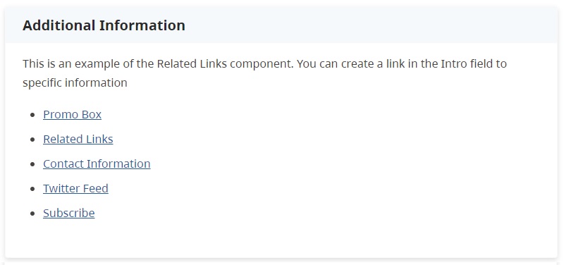
This is an example of a Related Links box. It would be displayed at the bottom of the webpage.
Types of supplemental content boxes
You can enhance your page with different types of Supplemental Content Boxes, including:
- Promo Box: Use this for promotions or important highlights
- Related Links: Add links to relevant internal or external pages
- Contact Information: Provide essential contact details
- Subscribe: Enable users to subscribe to page updates
- Chat with Us: Launches an instant messenger chat with a live agent. You must contact Service BC to use this component
The Twitter Feed component is no longer available for use on pages.
Guidelines for using supplemental content boxes
Placement
Content boxes have moved from the right-column to the bottom of the page.
- The Subscribe box is recommended to be placed at the top
- Contact Information should always be used to display contact information. It should be placed as the last box
Quantity limitations
- Up to four boxes: Up to four supplemental content boxes, in any combination, can be used at one time. When the maximum of four boxes is reached, the option to add new boxes will be disabled.
- Up to ten related links: There is a limit of ten links on the Related Links component.
Best practices
- Consistency: Ensure a uniform appearance for a better user experience
- Content Relevance: Choose boxes that add value and relevance to your page content
- Accessibility: Remember to adhere to web accessibility standards for all components
Navigation and functionality
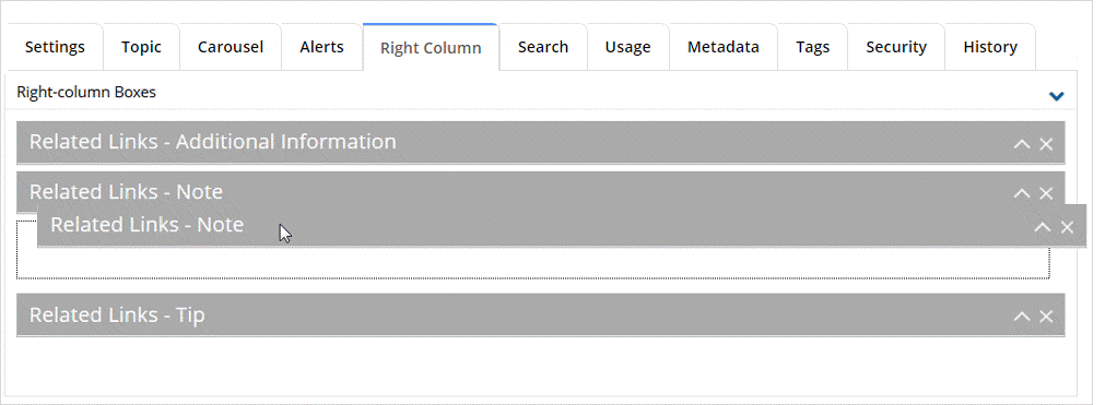
When editing a page with existing boxes, they will appear collapsed by default. Use the Item Control Bar to expand, reorder, or delete them.
Linking standards
For external links or downloadable files like PDFs, opening in a new tab or window is acceptable. For internal web pages, open links in the same window unless unless doing so will disrupt the workflow, confuse your audience, or terminate a secure session.
Always test link functionality in both QA and Production environments.
Adding new supplemental content boxes
Click image to view in full screen

To add a new supplemental content box:
- Select the [Add New Right-column Boxes] action button
- Choose one of the following from the drop-down list.
- Enter or update the box details
- If required, re-order the boxes by clicking on the grey Item Control Bar and dragging it to the new position
Delete a supplemental content box
To delete a box:
- Click on the X in the grey Item Control Bar
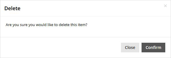
- Click [Confirm] to complete the action.

If you leave the page without saving your changes, the component will be re-inserted
Link to supplemental content boxes
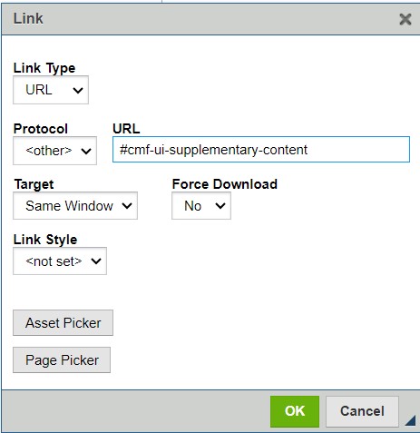
Supplemental content boxes have a built-in ID. This means you can link to them the same way you'd link to an anchor that you manually added.
The anchor name is #cmf-ui-supplementary-content


