Carousel tab
You should not use this feature without first discussing it with your GCPE Communications Director.
On this page
Carousel overview
A web carousel is a dynamic slideshow for websites, used to showcase featured content or images in a rotating fashion.
Reasons to avoid carousels
While carousels are available in CMS Lite, they are not recommended due to accessibility and usability concerns.
Reasons to avoid them include:
- Screen reader issue: May not work well with screen readers
- Slow: Slow page loading time
- Banner blindness: Carousels look like ads and may be ignored
- Distracting: Human eye reacts to movement. It takes control away from the person reading the page
- Hides content: People rarely click on any slide after the first one. Not everything can be important!
Sample carousel

Heading: 2023 Season Summary
Caption: The 2023 wildfire season has been the most destructive in British Columbia’s recorded history
Title link: Review the season
Position: Left
Image size
All images in the carousel should have the same dimensions and aspect ratio.
Learn more about graphic sizes in CMS Lite in the Visual Design Guide.
Carousel placement
Carousels are automatically placed:
- Below the breadcrumb on a sub-theme page
- Below the page title on a topic page
Add carousel panel
Before adding a carousel panel, you must:
- Understand the accessibility and usability concerns and
- Have discussed the option with your GCPE Communications Director
- Select the Carousel tab
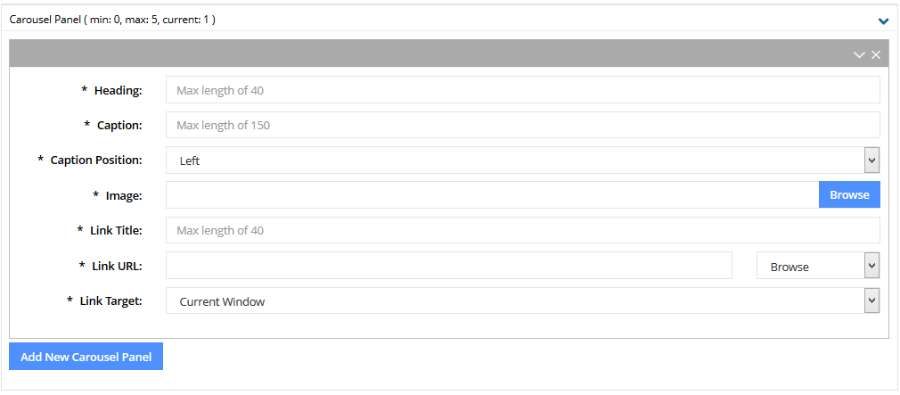
- Click the [Add New Carousel Panel] action button
- The Carousel Panel component will be displayed
- The Carousel Panel component will be displayed
- Enter an applicable title in the required Heading field
- Maximum of 40 characters
- Maximum of 40 characters
- Enter a caption in the required Caption field
- Maximum of 150 characters
- Maximum of 150 characters
- The caption default is set to the left side of the image. If desired, choose the drop-down arrow to set to right
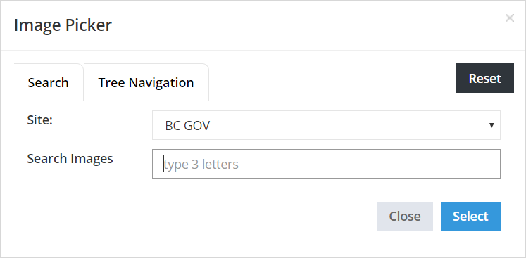
- Click on the [Browse] button to navigate to an image
The Image Picker will be displayed
- Search or Navigate to the applicable asset which has been uploaded into Asset folders
- Choose the [Select] to complete the action
The picker will be closed and the image field will be populated
- Enter an applicable link, up to a maximum of 40 characters, in the required Link Title field. Choose text that ensures accessibility. For example, Read more about x x x
- In the Link URL field, you may to link to a page/asset, or enter an external URL
- Enter a secure external URL (include https://), or
- Select the Browse drop-down menu and choose the applicable option

The applicable picker will be displayed
- Search or Navigate to the page/asset
- Choose the [Select] to complete the action
- The picker will be closed and the imageLinkUrl field will be populated
- The picker will be closed and the imageLinkUrl field will be populated
- The Target defaults to Current Window. Click the drop-down arrow to select New Window only if linking to an Asset
- Repeat steps 2 - 13 to add up to five carousel images. Once the maximum has been reached the [Add New Carousel Panel] action button will no longer be available
Configure carousel settings

- Click the [Add New Carousel Configuration] action button
The Carousel Configuration component will be displayed
- Enter a value between 3 to 10 (seconds) in the Rotation Delay field
- Enter a value between 0 to 100 (times) in the # of Rotations field. 1 rotation will display each image at least once and then stop when the first image is redisplayed; 0 = rotate endlessly until user interacts with left or right arrows
- The Randomize Start field defaults to NO (displays images in the panel order). Choose the drop-down arrow to change the option to YES to randomly display images


