Create a web accordion in CMS Lite
The accordion tool allows content to be displayed in a stacked format on a web page.
On this page
- Accessibility guidelines for accordion use
- Video tutorial
- Insert an accordion
- Add a panel to accordion
- Reordering panels
- Reordering multiple accordions
- Using anchors to link to accordions
- Remove the gap under accordion panels
Accessibility guidelines for accordion use
Accordions can make content harder to find and navigate. They require extra clicks, which may confuse users and hide important information. This is especially challenging for users with disabilities, as hidden content creates access barriers.
Do not use accordions for content needed by most visitors.
Expand all | Collapse all
Accordions panels must be nested inside an accordion.
- Accordions must be displayed with the Expand all | Collapse all links to meet accessibility standards.
Do not overuse accordions
- Do not use accordions to hide poorly designed or disorganized content
- Do not place accordions in supplementary content boxes (previously called "right-column boxes")
Do not use accordions in columns
Do not use accordions in multi-column layouts. Accordions in columns do not meet accessibility standards because they cannot be displayed with "Expand all | Collapse all" links.
Tutorial video
Watch a tutorial video to help you understand how to create and adjust accordions in CMS Lite.
Work with accordions in CMS Lite
Step-by-step instructions for B.C. government content editors on how to create a web accordion using the CMS Lite application. Review the Web Style Guide for the most current information.
Insert an accordion
To insert an accordion:
- Place the cursor in the Body: where the accordion content is to be inserted
- Select the BC Gov Accordion
 icon from the toolbar
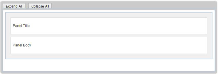
The Accordion container will be displayed
Accordions must be displayed with the Expand all | Collapse all links to meet accessibility standards.
Add panels to the accordion
To add a panel to an accordion:
- Click inside the container and select the Panel for the BC Gov Accordion
 icon.
icon.
The Accordion container will be displayed - Click in the Panel Title field and enter an applicable title to be displayed. Note that some of the formatting icons are disable for this field. Anchor tags may be used
- Click in the Panel Body field and enter the applicable information. Note most of the formatting icons are available for this field
- To create another panel, click in the white space below the existing Panel Body and select the Panel for the BC Gov Accordion
 icon and repeats Steps 4 and 5
Reorder panels
Maximizing the editing field makes it easier to rearrange panels, but save your work first.
To reorder the panels:
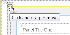
- Hover the mouse in the top-left corner above the Panel Title to display the move icon.
- Left click and drag into new position.
Alternately, you may right-click the top-left corner of the panel to cut and paste it into a new location.

Reorder multiple accordions
To reorder multiple accordions:
- Hover the mouse in the top-left corner above the Expand All button to display the move icon
- Left click and drag into new position.
Alternately, you may right-click the top-left corner of the accordion to cut and paste it into a new location.

Using anchors in accordions
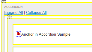
You can use an anchor link in the title section of an accordion panel. When you link to the anchor, the panel is automatically expanded.

This is a demonstration of using an anchor tag in the title of an accordion panel.
For the purposes of this demo, the following links will open in a new window (normally we always open web pages in the same browser window):
- Here is an anchor link to this accordion panel (this will expand the accordion)
- Here is an anchor link to the heading above this accordion (this will not expand the accordion)
Remove the gap under accordion panels
When creating accordions, CMS Lite may create a gap between the accordions and the next section of content.
Use this workaround to remove the gap:
- Hover: Move your mouse over the top-left corner of an existing accordion panel
- Copy: Right-click the icon that appears, then select "copy"
- Paste: Paste the copied panel to the empty space below the last accordion
- Select: Select the newly pasted panel by hovering over its top-left corner and clicking the icon
- Delete: Press "delete" on your keyboard to remove this panel
- Confirm: The gap should now be removed


