Toggle button

Toggle buttons enable the user to change a setting between binary or mutually-exclusive states.
On this page:
How to use this component
A toggle button enables the user to switch a setting between binary states, similarly to a switch.
Multiple toggle buttons can be grouped together, enabling the user to:
- Toggle between two or more mutually-exclusive options
- Toggle multiple discrete settings on or off
Structure and behaviour
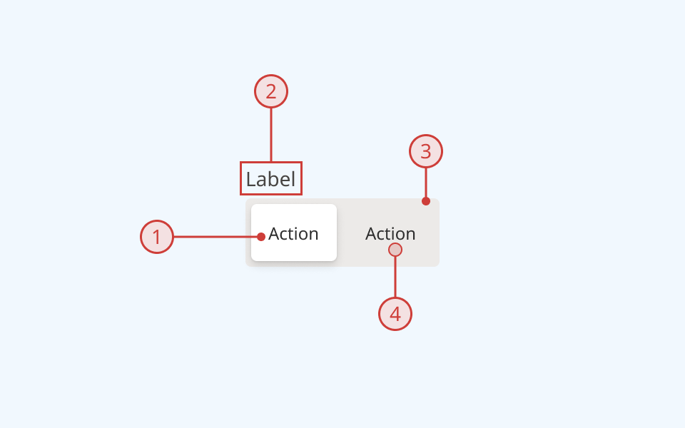
Anatomy

- Toggle button (active/selected)
- Group label, describing the function of this control or set of controls
- Wrapper element, containing some number of toggle buttons
- Toggle button (inactive/deselected)
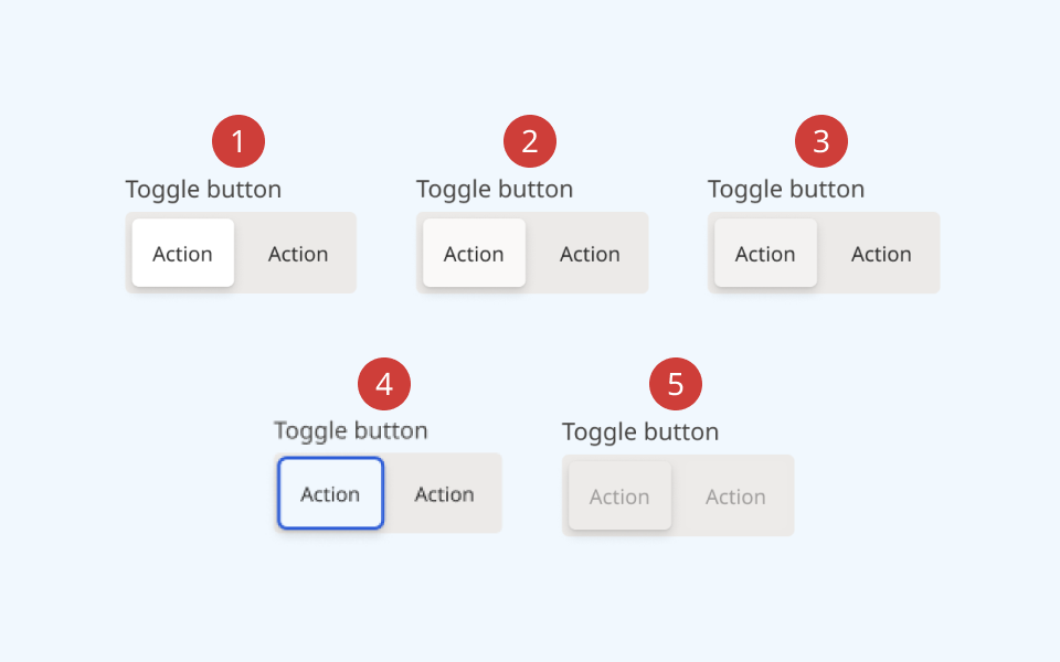
Behaviour

- Rest state, showing selected and deselected states
- On hover, the cursor and the button's background colour change
- On press, the button's background colour changes
- Keyboard focus is indicated by a different coloured background and border
- When a button or button group are disabled, elements are greyed out and cannot be focused or interacted with
Design guidance
Design system components are published in a Figma library. Install the library and add it to your project to start using this component.
An individual toggle can be implemented by itself, but they are more commonly used in a group. If your use case calls for only a single, binary setting, consider using a switch instead.
The toggle button group component provides a wrapper for multiple toggle buttons. This provides a flexible way to create groups of related controls. A toggle button group can either:
- Present a set of related controls, each of which has its own on/off state (for example, text formatting options)
- Present a set of mutually-exclusive controls, only one of which can be active at a time (for example, toggling between light and dark mode)
Toggle buttons support both a text label and icon slots to the left and right.
You can also create an icon-only toggle button. If using the toggle button component in its icon-only format, you must also provide a non-visible label using the aria-label property.
Controls
Toggle button
| Control | Options | Description |
|---|---|---|
| Selected |
|
Toggle the button between its selected and de-selected visual states |
| State |
|
Toggle between various interaction states |
| Size |
|
Toggle between default and reduced size buttons |
Toggle button group
| Control | Options | Description |
|---|---|---|
| Count |
|
Sets the number of buttons displayed, for ease of prototyping |
| Label |
|
Toggles display of a text label above the button group |
| Orientation |
|
Toggles between horizontal and vertical orientation |
| Size |
|
Toggle between default and reduced size (also applies to child buttons) |
Technical information
Detailed technical documentation, interactive previews and code samples are published in the B.C. Design System Storybook.
A reference implementation of the toggle button component in React is published in the React components library. Install the package via npm to start using the component.
The component is comprised of two subcomponents:
- ToggleButton: an individual button
- ToggleButtonGroup: a wrapper that groups multiple ToggleButtons together
Events and props
The toggle button component is a styled version of the React Aria ToggleButton and ToggleButtonGroup components.
Refer to the React Aria documentation for detailed information about the supported props for each component.
Accessibility
These summaries reflect the component used as provided. If you modify it, confirm that your changes comply with the Web Content Accessibility Guidelines (WCAG). B.C. government digital services are required to meet the WCAG Level AA standard.
| Requirement | WCAG Success Criterion | Validation |
|---|---|---|
| Make sure colour isn't the only way you convey information | 1.4.1 (Level A) |
Toggle button has a distinctive shape and rounded corners in both active and inactive states |
| Enhance visual contrast for user interface and graphics | 1.4.11 (Level AA) |
Toggle button fill and text colours exceed 4.5:1 contrast ratio in all states (except 'Disabled', which is exempt from SC 1.4.11) |
| Allow people to disable motion animations | 2.3.3 (Level AA) | Transition animation on a toggle button group respects the user's prefers-reduced-motion setting |
| Let people choose how they navigate content | 2.4.5 (Level AA) |
Toggle button and toggle button group are keyboard-navigable, with a visible hover/focus state |
| Show where the keyboard is active on the screen | 2.4.7 (Level AA) |
Toggle button focus state is indicated by a thicker border with an alternate colour. Hover state is indicated by a different background fill and cursor |
| Use consistent names in labels | 2.5.3 (Level AA) |
Toggle button and toggle button group both have visible text labels, and support semantic labelling via the aria-label property |
| Make sure interaction or click targets meet a minimum size | 2.5.8 (Level AA) |
Toggle button has a minimum target area of 24px by 24px |
| Make sure components can be read and used by assistive technology | 4.1.2 (Level A) |
Toggle button is semantically identifiable as a <button> element. Toggle button group has the ARIA "toolbar" role. Button labels and/or the aria-label property can be used to ensure readability |
