Footer

The footer is used to display secondary information and navigation.
On this page:
How to use this component
The footer should appear at the bottom of the page or screen. Do not use more than one instance of the footer component.
The footer is used to:
- Display the territorial acknowledgment used on gov.bc.ca and other B.C. government websites
- Communicate authorship and copyright information
- Display supporting and/or low-priority information about a product or website
- Provide a secondary navigation menu
The content of the footer should remain consistent across each page or screen.
Structure and behaviour

Anatomy
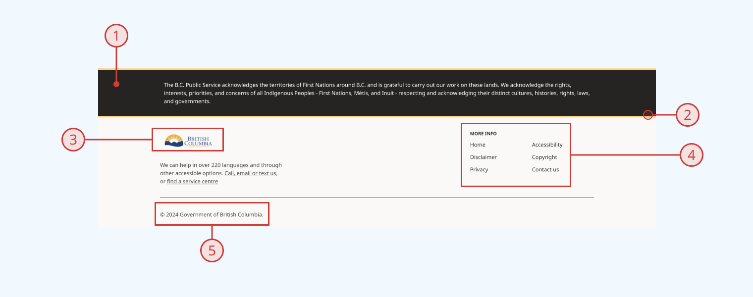
In its default configuration, the footer component has:
- A full-width territorial acknowledgment statement on a dark grey background
- A solid gold divider below the territorial acknowledgment
- A logo and text content on the left of the main content area
- A secondary navigation menu on the right of the main content area
- A copyright statement line at the bottom of the component
You can display or hide each section discretely.
Behaviour
- By default, the logo in the footer is not hyperlinked
- At smaller viewport sizes, the navigation menu collapses underneath the secondary content area
- Copyright year is set automatically to the current year
Design guidance
Design system components are published in a Figma library. Install the library and add it to your project to start using this component.
The footer component includes default content, based on the gov.bc.ca footer. You can modify this content to fit your specific needs.
A set of controls are provided for ease of prototyping:
| Control | Options | Description |
|---|---|---|
| Type |
|
Toggles between a set of default content based on gov.bc.ca, and a generic content area where you can swap in other components |
| Land acknowledgment |
|
Toggles display of the territorial acknowledgment block |
| Content |
|
Toggles display of the secondary content/navigation block |
| Copyright |
|
Toggles display of the copyright statement block |
Additional controls are provided to help you manipulate the content and layout of each of the footer's subcomponents.
Technical information
Detailed technical documentation, interactive previews and code samples are published in the B.C. Design System Storybook.
A reference implementation of the footer component in React is published in the React components library. Install the package via npm to start using the component.
Supported props
The component includes props to configure:
- Content:
- Territorial acknowledgment
- Logo
- Secondary content
- Navigation menu
- Copyright statement
- Visibility:
- Territorial acknowledgment area
- Content and navigation area
- Copyright area
Accessibility
These summaries reflect the component used as provided. If you modify it, confirm that your changes comply with the Web Content Accessibility Guidelines (WCAG). B.C. government digital services are required to meet the WCAG Level AA standard.
| Requirement | WCAG Success Criterion | Validation |
|---|---|---|
| Allow users to resize text | 1.4.4 (Level AA) |
Footer content reflows as user increases text size |
| Use responsive design to avoid losing content or context | 1.4.10 (Level AA) |
Footer content reflows as viewport size decreases |
| Make websites keyboard accessible | 2.1.1 (Level A) |
Footer is navigable and operable via keyboard, with visual indicators for focused elements |
| Prevent keyboard navigation traps | 2.1.2 (Level A) |
Footer has no keyboard traps |
| Ensure content reads in the right order for people using assistive technology | 2.4.3 (Level A) |
Keyboard tab moves focus state through footer elements from left to right |
| Show where the keyboard is active on the screen | 2.4.7 (Level AA) |
Focused elements are indicated with a visible border |
| Ensure user interface components behave predictably | 3.2.1 (Level A) |
Footer elements like menu items do not activate on focus, but when the user presses the enter key |
| Use consistent navigation | 3.2.3 (Level AA) |
Footer content should remain consistent across all usages (configuration-dependent) |
| Make sure components can be read and used by assistive technology | 4.1.2 (Level A) |
Footer is semantically identifiable as a <footer> element |
