Tooltip

Tooltips provide additional information when a user hovers over or focuses an element.
On this page:
How to use this component
Tooltips have limitations, and should be used sparingly. In particular, they do not work well on touch-based interfaces, like mobile devices.
Do not use them for essential information that the user needs to take an action or complete a process.
The tooltip component is a visible label that is only shown when the user hovers over or focuses a UI element (the 'trigger element'.)
Tooltips are used to provide additional or explanatory information. They are useful for providing additional context, without cluttering an interface.
For example, if you are using icons as buttons in an interface, you could use a tooltip to provide a visible label when the user hovers over the icon (in addition to using aria-label to provide an accessible label.)
Structure and behaviour
Anatomy

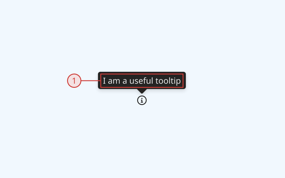
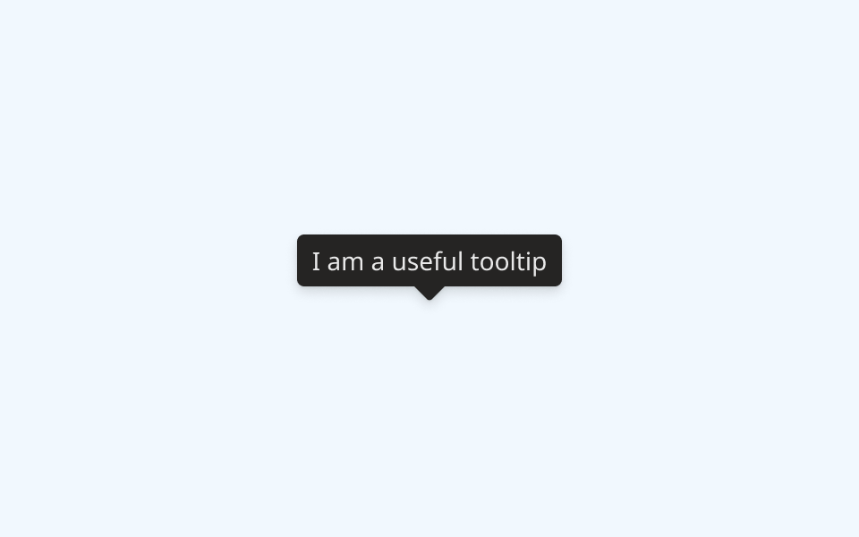
- The tooltip label is white text on a dark grey background
- Tooltips can be positioned above, below, left or right of their parent element
- An arrow decorator points to the centre (horizontal or vertical, depending on configuration) of the trigger element
Behaviour

- The tooltip is hidden by default
- Tooltips can optionally be set to open automatically on load
- When the user hovers over or focuses the trigger element, the tooltip is displayed
- When the user mouses away or presses the 'Escape' key, the tooltip is hidden
- The tooltip displays and hides immediately by default
- You can optionally set a timed delay on display, hide or both
Design guidance
Design system components are published in a Figma library. Install the library and add it to your project to start using this component.
Tooltips should only be used to display plain text. Do not include hyperlinks or other interactive elements within the tooltip. Labels should be kept as short as possible.
Because tooltips do not remain visible, they should not be used for essential information — for example, helper text for a form field or input should not be placed inside a tooltip.
The tooltip component uses a simple, high-contrast colourway. If you modify the colour of the tooltip container or label, ensure you use a colour pairing with a sufficiently high contrast ratio.
Controls
| Control | Options | Description |
|---|---|---|
| Direction |
|
Sets the positioning of the tooltip component relative to the trigger element |
Technical information
Detailed technical documentation, interactive previews and code samples are published in the B.C. Design System Storybook.
A reference implementation of the tooltip component in React is published in the React components library. Install the package via npm to start using the component.
In their current implementation, tooltips can only be applied to an element that is focusable.
Events and props
The tooltip component is a styled version of the React Aria tooltip component.
The component supports props to configure:
- Its positioning relative to the trigger element
- A time delay for open and/or close
- Default tooltip visibility
Refer to the React Aria documentation for detailed information about:
Accessibility
These summaries reflect the component used as provided. If you modify it, confirm that your changes comply with the Web Content Accessibility Guidelines (WCAG). B.C. government digital services are required to meet the WCAG Level AA standard.
| Requirement | WCAG Success Criterion | Validation |
|---|---|---|
| Make sure visual formatting is represented in the backend code | 1.3.1 (Level A) |
Tooltip is automatically associated to its trigger element via an aria-describedby attribute |
| Ensure people can use or read pop-up content | 1.4.13 (Level AA) |
Tooltip remains visible until the user moves the mouse away or presses 'Tab' or 'Escape' keys to change focus |
| Make websites keyboard accessible | 2.1.1 (Level A) |
Tooltip is displayed when its trigger element is focused using the keyboard |
| Prevent keyboard navigation traps | 2.1.2 (Level A) |
Tooltip is hidden when the user presses the 'Tab' or 'Escape' keys to change focus |
| Make sure components can be read and used by assistive technology | 4.1.2 (Level A) |
Tooltip is automatically associated to its trigger element via an aria-describedby attribute, and has the "tooltip" role |
