Number field

A number field enables the user to enter a numerical value into an interface or form.
On this page:
How to use this component
A number field enables the user to enter a numerical value, either by typing or using increment and decrement buttons.
Number fields allow you to constrain a submission to a specific format or range. For example, you can set:
- The units of measurement
- Minimum and/or maximum acceptable values
- Defined increments or steps
Do not use a number field for:
- Telephone numbers — use a text field
- Dates — use a date picker
Structure and behaviour
Anatomy

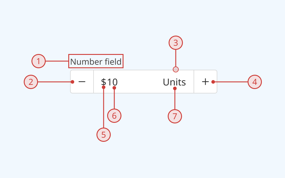
A number field component has:
- A text label, to explain the purpose of the input
- A decrement button to the left of the input
- A light border around the input field
- An increment button to the right of the input
- A prefix unit label (shown programmatically based on input type)
- A numerical value that can be set via button press or keyboard input
- A suffix unit label (shown programmatically based on input type)
An error message can also be displayed below the description when needed.
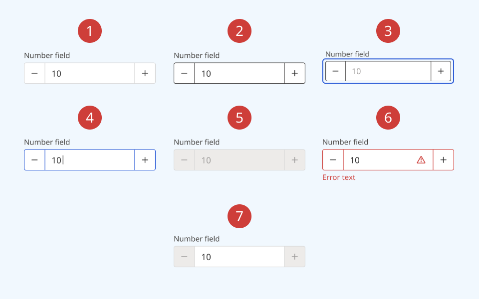
The number field supports the following states:
- Hover
- Focused/selected
- Invalid
- Disabled
- Read-only
Behaviour

- At rest, the number field is in its default state
- On hover, the border colour and cursor visibly change
- When the number field is keyboard-focused, an offset blue focus ring appears around it
- When the input field is selected, the border colour changes to its active shade
- When a number field is set to disabled:
- The background colour on the input and both buttons changes to grey
- A cursor indicator is shown on hover to indicate that it is disabled
- A disabled number field cannot be focused or interacted with
- When an input is invalid:
- The border colour changes to red
- A red 'error' icon is displayed on the right side of the number field
- A red error message is rendered below the number field
- When a number field is set to read-only:
- Increment and decrement buttons are disabled
- A read-only field can be selected and its value focused, but cannot be edited
Design guidance
Design system components are published in a Figma library. Install the library and add it to your project to start using this component.
Number fields strictly constrain the user's input to a numerical value. To accept mixed values (for example, alphanumeric strings), use a text field instead.
Units can be displayed and internationalized automatically. If you are using custom units that can't be rendered dynamically, add them in either the label or description.
If your use case requires hiding the input label, you must also provide a non-visible label using the aria-label property.
Controls
| Control | Options | Description |
|---|---|---|
| Size |
|
Toggles between the default (medium) input size and a more compact version with reduced height and smaller typography |
| State |
|
Toggles between different interaction states |
| Show label |
|
Toggles on/off the label above the input |
| Required |
|
Toggles display of a "required" label next to the input label |
| Description |
|
Toggles on/off the description below the input |
| Currency |
|
Toggles display of currency label (prefix) |
| Units |
|
Toggles display of units label (suffix) |
| Decimal |
|
Toggles between integer and decimal value format |
Technical information
Detailed technical documentation, interactive previews and code samples are published in the B.C. Design System Storybook.
A reference implementation of the button component in React is published in the React components library. Install the package via npm to start using the component.
Events and props
The number field component is a styled version of the React Aria number field component. Refer to the React Aria documentation for detailed information about its API and supported props.
Number formatting
You can control how a number field's value is formatted and submitted. This includes automatically displaying unit labels. Formatting options use the Intl.NumberFormat API.
Data validation
The text field component has built-in support for HTML and custom validation (for example, defining a minimum and/or maximum value.)
You can pass custom error messages programmatically to the error message slot below the input field.
Accessibility
These summaries reflect the component used as provided. If you modify it, confirm that your changes comply with the Web Content Accessibility Guidelines (WCAG). B.C. government digital services are required to meet the WCAG Level AA standard.
| Requirement | WCAG Success Criterion | Validation |
|---|---|---|
| Make sure visual formatting is represented in the backend code | 1.3.1 (Level A) |
Label and input field are automatically associated via an aria-labelledby attribute |
| Clearly define the purpose of input fields | 1.3.5 (Level AA) |
The input has a visible label, used to explain its purpose. Note: if you hide the visible label, you must use aria-label to provide a semantic label |
| Make websites keyboard accessible | 2.1.1 (Level A) |
Input field and increment/decrement buttons are focusable and fully operable using only the keyboard, with visual indicators for focused elements |
| Prevent keyboard navigation traps | 2.1.2 (Level A) |
When in focus, the user can exit the input field by pressing the 'Tab' key |
| Show where the keyboard is active on the screen | 2.4.7 (Level AA) |
Focus is indicated with a visible and offset secondary border around the input field and increment/decrement buttons |
| Make sure interaction or click targets meet a minimum size | 2.5.8 (Level AA) |
The input field has a minimum target area of 32px by 32px |
| Ensure user interface components behave predictably | 3.2.1 (Level A) |
Input value does not change and is not submitted on focus |
| Make sure components can be read and used by assistive technology | 4.1.2 (Level A) |
The input field is automatically associated to its label via an aria-labelledby attribute, and has the input role |
