Date picker

A date picker enables the user to enter a date or date/time value into an interface or form.
On this page:
How to use this component
A date picker enables the user to enter a date value into a form or interface. They are commonly used for:
- Dates of birth or other biographical information
- Booking or scheduling
Date pickers allow only a single value, not a range. You can use two date pickers together to receive a date range.
The date picker can accept either a date (default) or a date-time value. Alternatively, you can use a date picker and a time field together to collect separate date and time values.
Note: a separate date range picker is planned for a future release.
Structure and behaviour
Anatomy

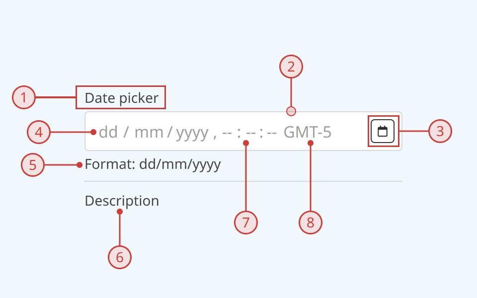
A date picker has:
- A text label, to explain the purpose of the input
- A light border around the input field
- A button to activate a popover containing a calendar
- Individually-selectable and editable segments for each part of the date/time value
- Automatically-generated helper text describing the expected date format (optional)
- Additional description or helper text (optional)
- Time value (optional)
- Time-zone value (optional)
An error message can also be displayed below the description when needed.
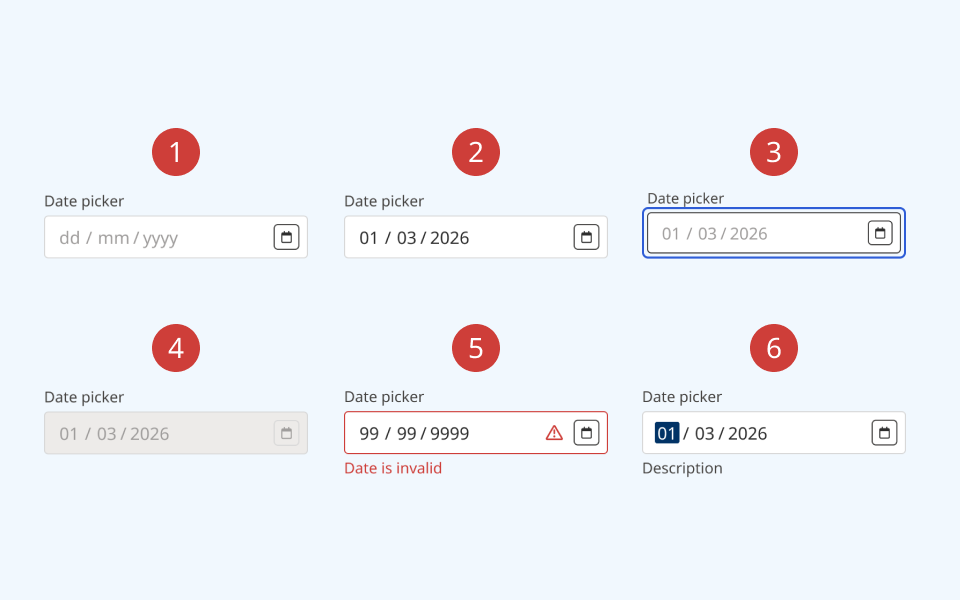
The date picker supports the following states:
- Hover
- Focused/selected
- Invalid
- Disabled
- Read-only
Behaviour

- At rest, the date picker is in its default state
- On hover, the border colour and cursor visibly change
- When the date picker is keyboard-focused, an offset blue focus ring appears around it
- When a date picker is set to disabled:
- The background colour on the input and button changes to grey
- A cursor indicator is shown on hover to indicate that it is disabled
- A disabled text field cannot be focused or interacted with
- When an input is invalid:
- The border colour changes to red
- A red 'error' icon is displayed on the right side of the input
- A red error message is rendered below the date picker
- When the user selects the date value:
- The currently-selected segment is highlighted
- The user can change the value by typing or using the up and down arrow keys
- The user can move between segments using the left and right arrow keys
Design guidance
Design system components are published in a Figma library. Install the library and add it to your project to start using this component.
Note that if using a date picker to accept a date/time value, only the date can be selected via the calendar popover. The time will default to midnight on the selected date, and the user must edit it manually. Consider collecting the time via a separate input unless your use-case requires a complete date/time string.
If needed, you can disable the calendar button and its associated popover. This is not recommended for most use-cases.
If your use case requires hiding the input label, you must also provide a non-visible label using the aria-label property.
Controls
| Control | Options | Description |
|---|---|---|
| Size |
|
Toggles between the default (medium) input size and a more compact version with reduced height and smaller typography |
| State |
|
Toggles between different interaction states |
| Show label |
|
Toggles on/off the label above the input |
| Required |
|
Toggles display of a "required" label next to the input label |
| Format label |
|
Toggles display of additional helper text explaining the expected date format |
| Description |
|
Toggles on/off the description below the input |
| Show calendar |
|
Toggles display of the button to open a calendar in a popover |
Technical information
Detailed technical documentation, interactive previews and code samples are published in the B.C. Design System Storybook.
A date picker receives a date or date/time value as an ISO 8601 string.
By default, a date picker renders with the en-CA locale. This is used to set the date format. Alternatively, you can allow the date picker to set the date format, calendar system and time-zone automatically based on the user's browser locale, using the @internationalized/date package.
Events and props
The date picker component is a styled version of the React Aria date picker component. Refer to the React Aria documentation for detailed information about its API and supported props.
Accessibility
These summaries reflect the component used as provided. If you modify it, confirm that your changes comply with the Web Content Accessibility Guidelines (WCAG). B.C. government digital services are required to meet the WCAG Level AA standard.
| Requirement | WCAG Success Criterion | Validation |
|---|---|---|
| Make sure visual formatting is represented in the backend code | 1.3.1 (Level A) |
Label and input field are automatically associated via an aria-labelledby attribute |
| Clearly define the purpose of input fields | 1.3.5 (Level AA) |
The input has a visible label, used to explain its purpose. Note: if you hide the visible label, you must use aria-label to provide a semantic label |
| Make websites keyboard accessible | 2.1.1 (Level A) |
Input field, calendar button and popover are focusable and fully operable using only the keyboard, with visual indicators for focused elements |
| Prevent keyboard navigation traps | 2.1.2 (Level A) |
When in focus, the user can exit the input field by pressing the 'Tab' key. User can open, navigate and close the calendar popover using the keyboard |
| Show where the keyboard is active on the screen | 2.4.7 (Level AA) |
Focus is indicated with a visible and offset secondary border around the input field, calendar button and individual items inside the calendar popover |
| Make sure interaction or click targets meet a minimum size | 2.5.8 (Level AA) |
The input field has a minimum target area of 32px by 32px |
| Ensure user interface components behave predictably | 3.2.1 (Level A) |
Input value does not change and is not submitted on focus |
| Make sure components can be read and used by assistive technology | 4.1.2 (Level A) |
The input field is automatically associated to its label via an aria-labelledby attribute, and has the input role |
