Accordion group

Accordions display content inside a container that the user can open and close.
On this page:
How to use this component
An accordion displays content inside one or more collapsible containers. The user can show or hide the content in an accordion by clicking or pressing on it. Multiple related accordions can be stacked in an accordion group.
Accordions are useful in space-constrained interfaces, for displaying secondary or supporting content that doesn't need to be visible by default.
Structure and behaviour
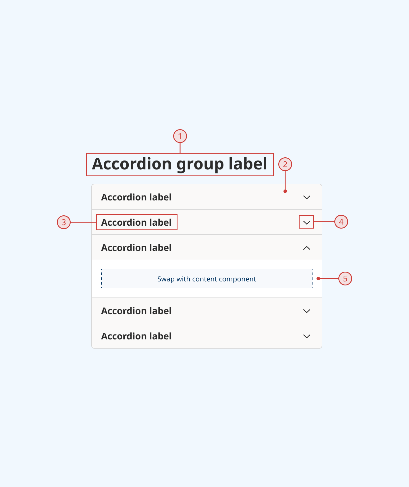
Anatomy
- Group label
- Trigger button to open and close an accordion
- Accordion label
- Icon indicating whether an accordion is currently open or closed
- Content container
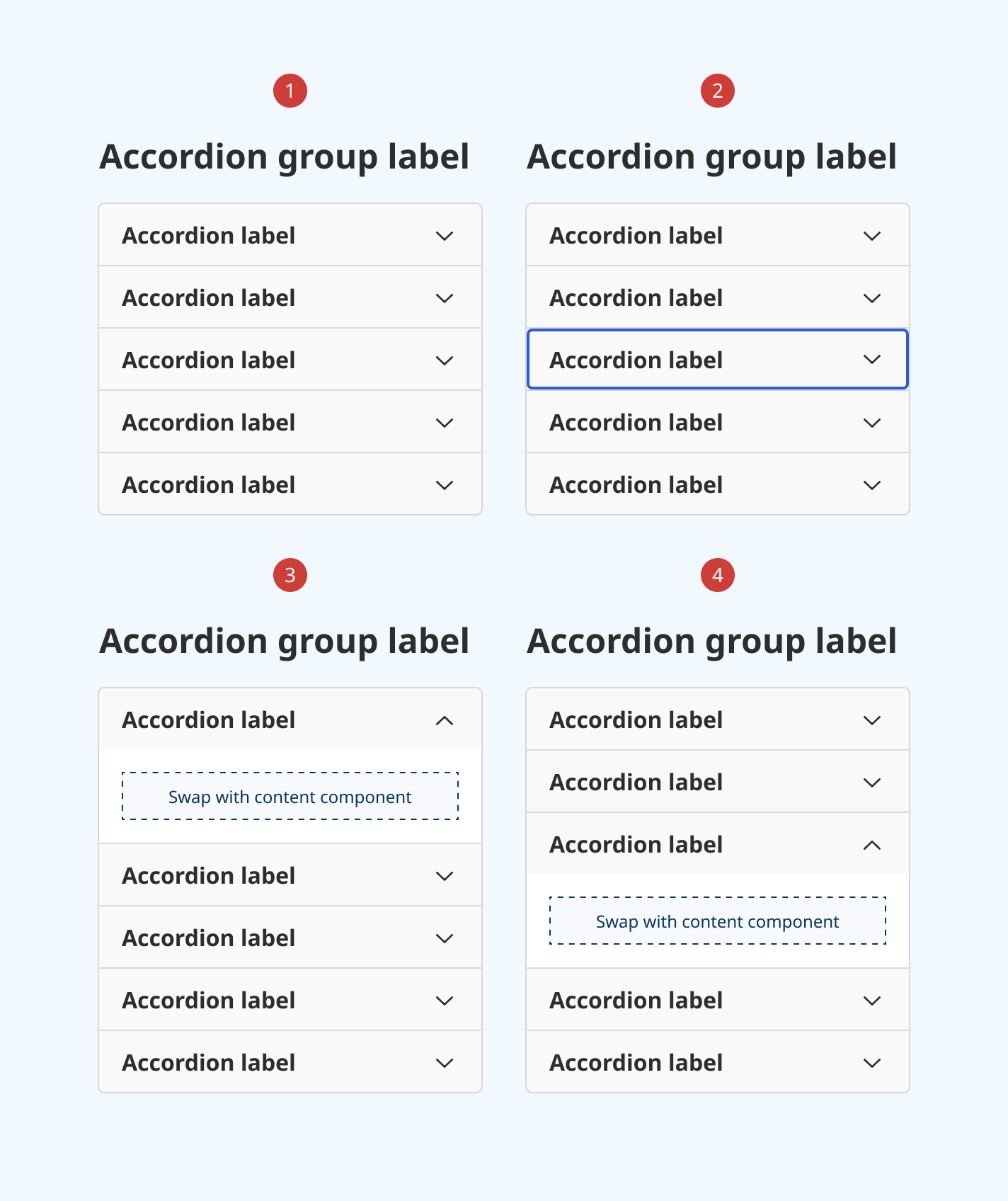
Accordion and accordion group support the following interaction states:
- Hover
- Focus
- Disabled

Behaviour
- By default, all accordions are closed
- Optionally, one or more accordions can be set to open by default
- When an accordion is in focus, an additional blue focus indicator is displayed
- When the user clicks or presses the trigger button, the accordion container opens and the indicator icon changes
- The user can click or press again to close an accordion
- By default, only one accordion can be open at a time. An accordion will close automatically when another is opened
- Optionally, can allow multiple accordions to be open simultaneously

Design guidance
Design system components are published in a Figma library. Install the library and add it to your project to start using this component.
Accordions should be used sparingly. Important content or information that the user needs to use your product or service should not be placed in an accordion.
Controls
Accordion
| Control | Options | Description |
|---|---|---|
| State |
|
Toggles between different interaction states for ease of prototyping |
Accordion group
| Control | Options | Description |
|---|---|---|
| State |
|
Toggles all items in an accordion group open or closed |
| Number of accordions |
|
Sets the number of accordions displayed in a group Note: this control is provided for ease of prototyping. It is not a hard limit. |
| Title |
|
Toggles display of the accordion group title |
Technical information
Detailed technical documentation, interactive previews and code samples are published in the B.C. Design System Storybook.
Reference implementations of the accordion and accordion group in React are published in the React components library. Install the package via npm to start using the component.
Events and props
These components are based on React Aria's Disclosure and Disclosure Group components. Each has its own set of props, which you can use to configure an accordion's behaviour (for example, whether an accordion is open or closed by default.)
Accordion
An accordion renders a trigger button with a heading (used to label and open/close the accordion) and a content container. Pass content and components as children to populate it.
Accordion group
An accordion group wraps multiple related accordions together, and enables you to configure their behaviour as a group. It expects some number of accordions to be passed as children.
Additional props are provided to set and style an optional title, displayed above the group.
Accessibility
These summaries reflect the component used as provided. If you modify it, confirm that your changes comply with the Web Content Accessibility Guidelines (WCAG). B.C. government digital services are required to meet the WCAG Level AA standard.
| Requirement | WCAG Success Criterion | Validation |
|---|---|---|
| Make sure visual formatting is represented in the backend code | 1.3.1 (Level A) |
Accordion label and content are automatically associated via an aria-labelledby attribute |
| Make websites keyboard accessible | 2.1.1 (Level A) |
Accordion is focusable and fully operable via keyboard input. When focused, an accordion can be opened and closed using the space bar |
| Ensure content reads in the right order for people using assistive technology | 2.4.3 (Level A) |
Focus moves through items in an accordion group vertically from top to bottom |
| Show where the keyboard is active on the screen | 2.4.7 (Level AA) |
When in focus, an accordion displays a border of a different thickness and colour |
| Make sure interaction or click targets meet a minimum size | 2.5.8 (Level AA) |
Minimum target area for the accordion trigger button exceeds 24px by 24px |
| Ensure user interface components behave predictably | 3.2.1 (Level A) |
Accordions do not open or close on focus change |
| Make sure components can be read and used by assistive technology | 4.1.2 (Level A) |
Accordion is automatically associated to its label via an aria-labelledby attribute, and has the group role |
