Buttons

Buttons enable the user to easily identify and perform an action in your product.
On this page:
How to use this component
Use buttons to help the user progress or complete a task. Do not use them for general navigation.
Buttons are visually prominent, to help the user quickly identify and take an action. The user must be able to interact with a button via click, touch or keyboard input.
They should be used sparingly. Having multiple buttons visible on screen increases cognitive load and can create confusion. If you are using multiple buttons, use different variants to indicate hierarchy and function.
Structure and behaviour
Anatomy

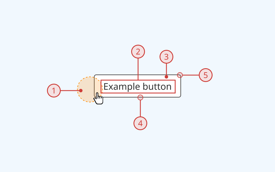
A button component usually has:
- A clickable area of at least 32px by 32px
- A text label
- A background fill
- A border stroke
- Rounded corners
Optionally, the button component can also display either one or two icons, arrayed to the left and/or right of the label text.
Behaviour

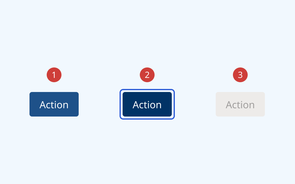
- On hover, the fill colour changes to the lighter 'hover' shade and the cursor changes
- When the button is focused, it displays an offset blue focus ring
- When a button is disabled:
- The background and text colours change to grey
- A cursor indicator is shown on hover to indicate that it is disabled
- The button cannot be focused or interacted with
Configurations
Button variants
Four button variants are included:
| Variant | Use case |
|---|---|
| Primary | Default button style for key actions like 'Start' or 'Confirm'. Do not use more than one per page or screen |
| Secondary | Used for secondary/supporting actions like 'Cancel' or 'Back'. Can be used in combination with a primary button or multiple secondary buttons |
| Tertiary | Low-profile ('ghost button') style. Can be used alongside or as an alternative to secondary buttons |
| Link | Plain/hyperlink style. Can be used for navigation menus or low-priority actions |
Button properties
Properties are toggleable options that can be applied in various combinations to any of the 4 button variants:
| Property | Options | Description |
|---|---|---|
| Size |
|
Changes vertical padding on buttons. 'Small' and 'extra small' states provide a thinner button that is more practical for use in compact/constrained contexts. 'Large' is intended for use as a primary call-to-action in cases where multiple buttons are visible |
| Danger |
|
Adds a red fill/stroke to button. Use for actions like 'Cancel' or 'Delete' |
| Disabled |
|
Converts button to greyed-out/inactive state. Use only when a button cannot currently be interacted with |
| Icon(s) |
|
Toggles ability to display a graphical icon on the left, right or both sides of the button label. Can be used to create an icon-only button |
Design guidance
Design system components are published in a Figma library. Install the library and add it to your project to start using this component.
The button is a modular component, with an extensive set of built-in options used to configure its appearance and behaviour in Figma.
The button component can be configured with:
- A text label only
- A text label and either 1 or 2 icons (arrayed to left and/or right of the label)
- A single icon and no text label
If using the button component in its icon-only format, you must also provide a non-visible label using the aria-label property.
Controls
| Control | Options | Description |
|---|---|---|
| Hierarchy |
|
Toggles between top-level button variants |
| State |
|
Toggles between different interaction states |
| Size |
|
Toggles between different sizes of the button |
| Danger |
|
Toggles on/off a red colourway for use with actions like 'Cancel' or 'Delete' |
| Show left icon |
|
Toggles on/off an icon to the left of the button label |
| Show right icon |
|
Toggles on/off an icon to the right of the button label |
Technical information
Detailed technical documentation, interactive previews and code samples are published in the B.C. Design System Storybook.
A reference implementation of the button component in React is published in the React components library. Install the package via npm to start using the component.
Events and props
The button component is a styled version of the React Aria button component. Refer to the React Aria documentation for detailed information about:
Button group
The React library also includes a utility component called ButtonGroup. This wrapper component is intended for use when multiple buttons need to be arrayed alongside one another.
ButtonGroup applies some basic styling to properly space and align multiple buttons relative to one another. It supports props to configure orientation and alignment, and expects an array of buttons passed as children.
Accessibility
These summaries reflect the component used as provided. If you modify it, confirm that your changes comply with the Web Content Accessibility Guidelines (WCAG). B.C. government digital services are required to meet the WCAG Level AA standard.
| Requirement | WCAG Success Criterion | Validation |
|---|---|---|
| Make sure colour isn't the only way you convey information | 1.4.1 (Level A) |
Button has a distinctive shape and rounded corners to differentiate it within the user interface |
| Enhance visual contrast for user interface and graphics | 1.4.11 (Level AA) |
Button fill and text colours exceed 4.5:1 contrast ratio in all states (except 'Disabled', which is exempt from SC 1.4.11) |
| Let people choose how they navigate content | 2.4.5 (Level AA) |
Button is keyboard-navigable, and has a visible hover/focus state |
| Show where the keyboard is active on the screen | 2.4.7 (Level AA) |
Button focus state is indicated by an offset border ring. Hover state is indicated by a different background fill and cursor |
| Use consistent names in labels | 2.5.3 (Level AA) |
Button has a visible text label, and supports semantic labelling via the aria-label property (essential if using icon-only button) |
| Make sure interaction or click targets meet a minimum size | 2.5.8 (Level AA) |
Button has a minimum target area of 32px by 32px |
| Make sure components can be read and used by assistive technology | 4.1.2 (Level A) |
Button is semantically identifiable as a <button> element. Button label and/or aria-label property can be used to ensure readability |
