Tags

Tags are used to label and filter content in an interface.
On this page:
How to use this component
The tag component provides a method to label and categorise content in an interface. They enable the user to enable the user to sort, filter or otherwise change the content being displayed, to more easily find what they need.
They are useful for dense or content-rich contexts like:
- Search
- Inputs
- Lists of items and content
Tags can also be hyperlinked, to help the user navigate to other content.
Structure and behaviour
Anatomy

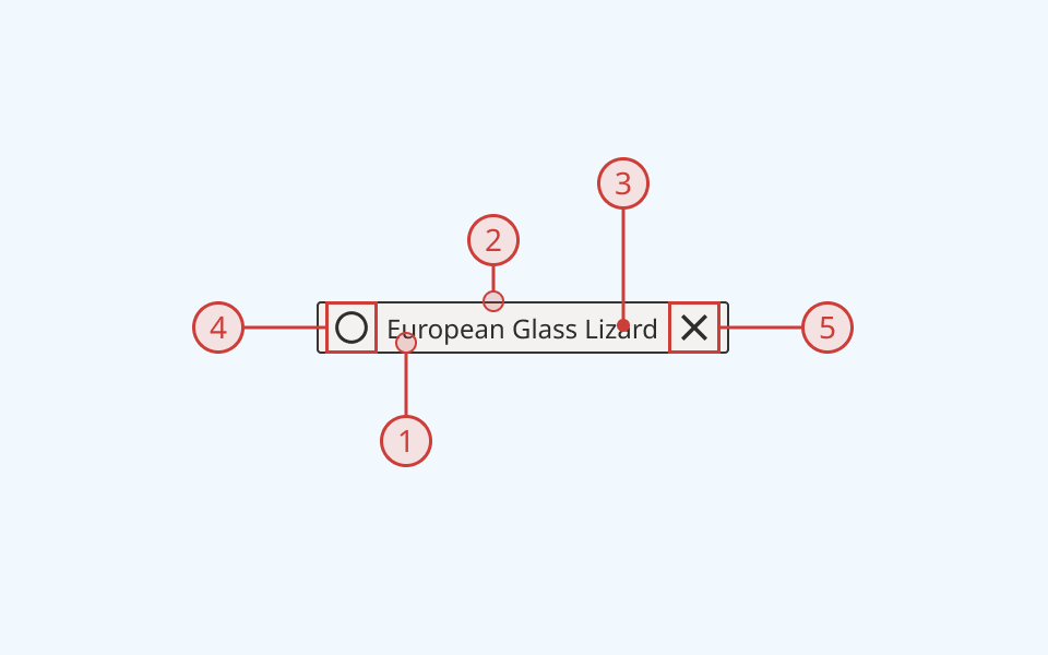
Each tag has:
- A coloured background
- A dark border
- A text label
- An icon, arrayed to the left of the text label (optional)
- A 'close' or 'remove' icon, arrayed to the right of the text label (optional)
Multiple tags grouped together are arrayed horizontally, and can also display:
- A text label for the tag group
- An error message, if needed
Behaviour

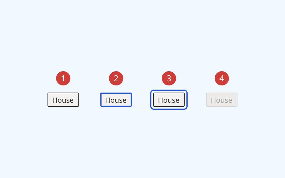
- At rest, the tag is in its default state
- When the user selects or removes a tag, its border thickness and colour change
- When the user focuses a tag, it receives an offset border ring
- When a tag is marked as disabled, it is greyed out and cannot be focused or clicked
Variants
Tags come with two visual styles: a default rectangular style, and an alternative rounded style (often called a 'chip' or 'pill'):
Rectangular (default)

Circular (alternative)

Design guidance
Design system components are published in a Figma library. Install the library and add it to your project to start using this component.
Tags are useful for providing additional context for a list of options, and enabling a user to remove or hide non-relevant content. They should be used as a secondary sorting and filtering tool, not as a primary method of navigating content.
Avoid displaying long lists of tags, as they can clutter an interface and make navigating content confusing.
By default, the tag component supports displaying up to 8 tags. If you have more than 8 tags, consider revisiting how you're organising your content.
Controls
The tag component has two subcomponents in Figma, each with their own set of controls:
- The tag group, used to group and label multiple tags together
- The invidual tag items themselves
Tags
| Control | Options | Description |
|---|---|---|
| State |
|
Toggles between different interaction states |
| Style |
|
Toggles between default rectangular style and alternative circular ('chip') style |
| Colour |
|
Toggles tag colour. 8 predefined colourways are included as a starting point. |
| Icon |
|
Toggles on/off an icon on the left of the tag |
| Closeable |
|
Defines whether a tag is closable/removable. Toggles on/off a 'close' icon on the right of the tag |
| Tag text |
|
Sets label text for the tag |
Tag group
| Control | Options | Description |
|---|---|---|
| State |
|
Toggles between different interaction states |
| Colour |
|
Toggles tag colour. 8 predefined colourways are included as a starting point. |
Technical information
Detailed technical documentation, interactive previews and code samples are published in the B.C. Design System Storybook.
A reference implementation of the tag component in React is published in the BCDS React components library. Install the package via npm to start using the component.
Supported props
The tag component is a styled version of the React Aria TagGroup component. It relies on the TagList and Tag subcomponents.
Refer to the React Aria documentation for detailed information about:
Selection
You can configure a group of tags to allow the user to select a single or multiple options. You can also set individual tags to be selected by default, or disable them entirely.
Selection behaviour is disabled if a tag is hyperlinked.
Accessibility
These summaries reflect the component used as provided. If you modify it, confirm that your changes comply with the Web Content Accessibility Guidelines (WCAG). B.C. government digital services are required to meet the WCAG Level AA standard.
| Requirement | WCAG Success Criterion | Validation |
|---|---|---|
| Make sure colour isn't the only way you convey information | 1.4.1 (Level A) |
Tags have a distinctive shape and rounded corners to differentiate them within the user interface |
| Enhance visual contrast for user interface and graphics | 1.4.11 (Level AA) |
Tag fill and text colours exceed 4.5:1 contrast ratio in all states (except 'Disabled', which is exempt from SC 1.4.11) |
| Let people choose how they navigate content | 2.4.5 (Level AA) |
Tags can be navigated, selected and deselected using the keyboard |
| Show where the keyboard is active on the screen | 2.4.7 (Level AA) |
Tag focus state is indicated by an offset border ring |
| Use consistent names in labels | 2.5.3 (Level AA) |
Tags have a visible text label, and supports semantic labelling via the aria-label property |
| Make sure interaction or click targets meet a minimum size | 2.5.8 (Level AA) |
Tags have a minimum target area of 32px by 32px |
| Ensure user interface components behave predictably | 3.2.1 (Level A) | Tags are not selected or deselected automatically on focus |
| Make sure components can be read and used by assistive technology | 4.1.2 (Level A) |
Tags are grouped and labelled using aria-labelledby attributes |
