Text area

A text area enables a user to enter multiple lines of text into an interface or form.
On this page:
How to use this component
The text area component enables the user to enter larger quantities of plain text into an interface or form.
Text areas should be used instead of text fields when the user has to enter multiple lines of text. They are useful in cases where the user needs to provide a detailed response to a question or prompt.
The text area component does not support rich text editing.
Structure and behaviour
Anatomy

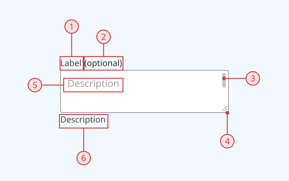
A text area has:
- A text label, to explain the purpose of the input
- A secondary label, indicating when a selection is required or optional
- An input field with a light border
- A scroll bar will render when needed
- A sizer in the bottom right-hand corner, enabling the user to re-size the text area
- A text input slot
- A text description below the input field, to provide additional helper text (optional)
If a maximum input length is defined, a character counter will display to the right of the description slot. An error message can also be displayed below the description when needed.
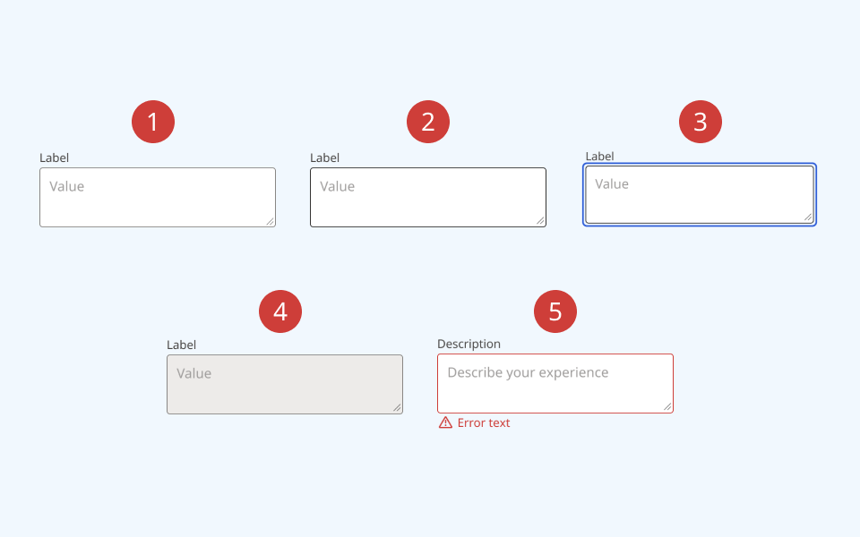
The text field supports the following states:
- Hover
- Focused/selected
- Invalid
- Disabled
- Read-only
Behaviour

- At rest, the text field is in its default state
- On hover, the border colour and cursor visibly change
- When the text field is focused or selected:
- An offset blue focus ring appears around the input field
- A flashing cursor appears in the text field to indicate that it can accept input
- When an input is set to disabled or read-only:
- The background colour changes to grey
- A cursor indicator is shown on hover to indicate that it is disabled
- A disabled text area cannot be focused or interacted with
- A read-only text area can be selected, but cannot be edited
- When an input is invalid:
- The border colour changes to red
- A red error icon and message are rendered below the text field
Design guidance
Design system components are published in a Figma library. Install the library and add it to your project to start using this component.
The text area component is a derived from and behaves similarly to the text field component.
All of its parts (except the input field itself) can be shown or hidden as needed, depending on your use case.
If your use case requires hiding the input label, you must also provide a non-visible label using the aria-label property.
Input controls
| Control | Options | Description |
|---|---|---|
| State |
|
Toggles between different interaction states |
| Filled |
|
Toggles between placeholder and user-filled text |
| Show count |
|
Toggles a character counter, for fields with a maximum input length |
| Description |
|
Toggles an optional description below the input field |
| Label |
|
Toggles the primary label above the input field |
| Scrollable |
|
Toggles a visible scroll bar within the input field |
Label controls
| Control | Options | Description |
|---|---|---|
| Required |
|
Toggles a secondary "(required)" label above the input field |
| Label text |
String |
Sets the label text above the input field |
Technical information
Detailed technical documentation, interactive previews and code samples are published in the B.C. Design System Storybook.
A reference implementation of the text area component in React is published in the React components library. Install the package via npm to start using the component.
Supported props
The button component is a styled version of the React Aria text field component. It is structurally similar to a text field, but renders an HTML <TextArea> element instead of an <Input>. Refer to the React Aria documentation for detailed information about:
Data validation
The text field component has built-in support for HTML constraint validation (for example, whether an input is required, or a maximum length) and custom validation.
You can pass custom error messages programmatically to the error message slot below the input field.
Accessibility
These summaries reflect the component used as provided. If you modify it, confirm that your changes comply with the Web Content Accessibility Guidelines (WCAG). B.C. government digital services are required to meet the WCAG Level AA standard.
| Requirement | WCAG Success Criterion | Validation |
|---|---|---|
| Make sure visual formatting is represented in the backend code | 1.3.1 (Level A) |
Label and input field are automatically associated via an aria-labelledby attribute |
| Clearly define the purpose of input fields | 1.3.5 (Level AA) |
The input has a visible label, used to explain its purpose. Note: if you do hide the visible label, you must use aria-label to provide a semantic label |
| Make websites keyboard accessible | 2.1.1 (Level A) |
Text area is focusable and fully operable using only the keyboard, with visual indicators for focused elements |
| Prevent keyboard navigation traps | 2.1.2 (Level A) |
When in focus, the user can exit the text area by pressing the 'Tab' key |
| Show where the keyboard is active on the screen | 2.4.7 (Level AA) |
Focus is indicated with a visible and offset secondary border around the input field |
| Make sure interaction or click targets meet a minimum size | 2.5.8 (Level AA) |
The input field has a minimum target area of 32px by 32px |
| Ensure user interface components behave predictably | 3.2.1 (Level A) |
Input value does not change and is not submitted on focus |
| Make sure components can be read and used by assistive technology | 4.1.2 (Level A) |
The input field is automatically associated to its label via an aria-labelledby attribute, and has the input role |
