Callout

A callout visually highlights a section of content within an interface.
On this page:
How to use this component
Callouts are used to highlight specific pieces of content within a user interface. Use a callout to give the user important information, like instructions on how to complete a process.
Callouts are intended for static content. Do not use a callout to display a dynamic or context-specific message or alert, like an error message or status notification. Use an inline alert or alert banner instead.
Structure and behaviour
The callout component ships with a precomposed layout. Alternatively, you can override the default layout and compose your own.
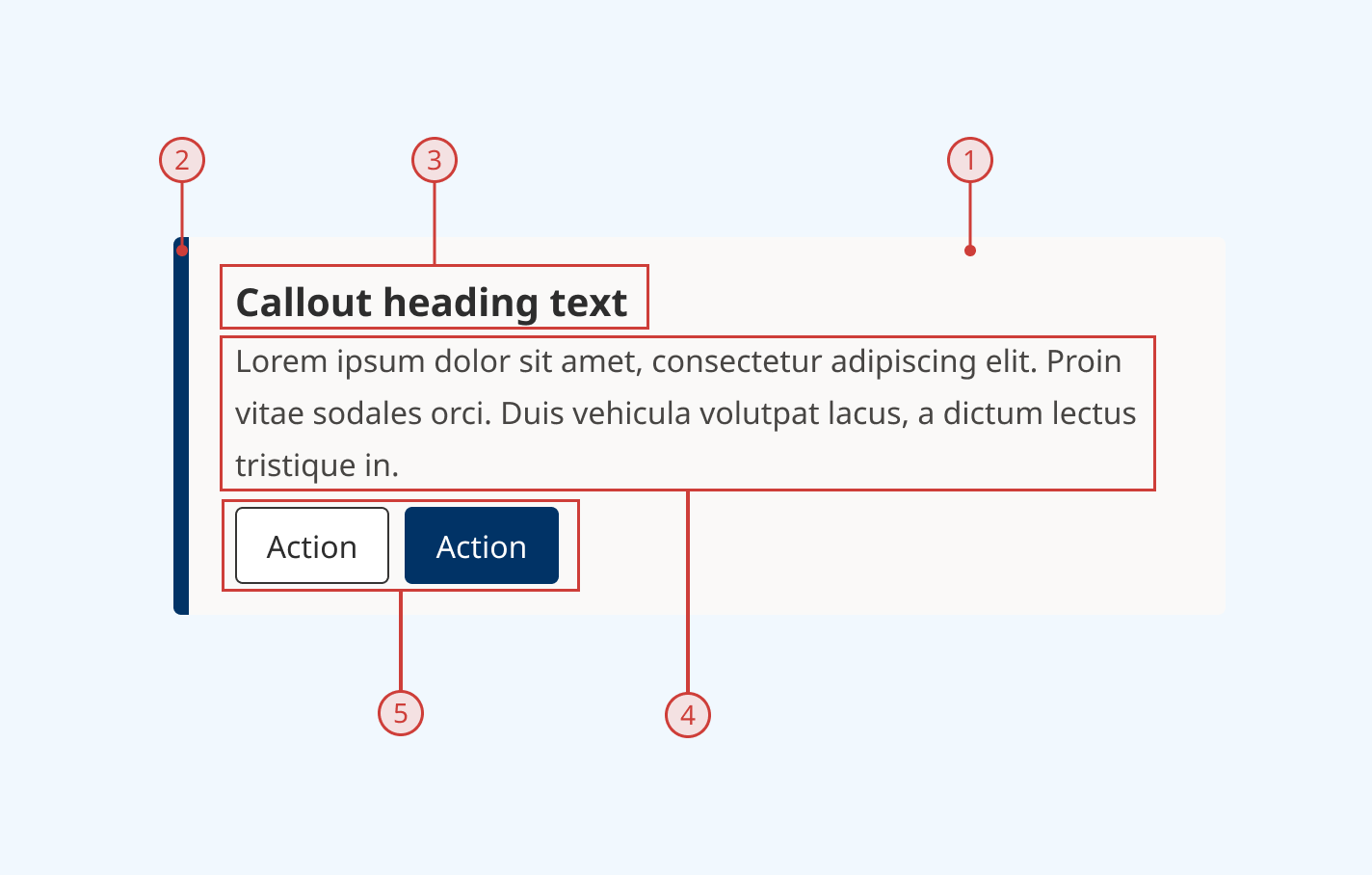
Anatomy
- Coloured background to differentiate the callout within the UI
- Accent bar to further highlight the callout
- Callout title (optional)
- Callout description (optional)
- Button group (optional)

Variants
Callout variants provide a set of different colourways. Pick the variant best suited to your interface.
Light grey (default)

Light blue

Light gold

Dark blue

Grey

Black

Design guidance
Design system components are published in a Figma library. Install the library and add it to your project to start using this component.
Callouts are intended to be displayed full-width within their parent container.
Use them sparingly and only for important information, to preserve their visual impact. Avoiding having multiple callouts visible on the same screen.
You can show or hide specific elements of a callout — for example, the accent stroke on the left edge — as needed.
Controls
| Control | Options | Description |
|---|---|---|
| Colour |
|
Sets the visual theme of the callout |
| Stroke |
|
Toggles display of the accent stroke on the left edge of the callout |
| Heading |
|
Toggles display of the callout heading field |
| Actions |
|
Toggles display of the optional button group |
Technical information
Detailed technical documentation, interactive previews and code samples are published in the B.C. Design System Storybook.
A reference implementation of the callout component in React is published in the React components library. Install the package via npm to start using the component.
The callout component renders a styled <div> with an ARIA role to identify it to assistive technologies.
Props
The callout component comes with a precomposed layout. You can use props to:
- Set the callout variant
- Populate the title and description slots
- Pass in buttons (rendered inside a button group)
- Show or hide the accent stroke on the left edge
If needed, you can override the default layout and compose your own by passing components to the children slot.
ARIA roles
By default, a callout renders with the ARIA "note" role. You can change this using the 'role' prop, which will accept any valid ARIA role. We recommend using either "note" or "complementary".
Accessibility
These summaries reflect the component used as provided. If you modify it, confirm that your changes comply with the Web Content Accessibility Guidelines (WCAG). B.C. government digital services are required to meet the WCAG Level AA standard.
| Requirement | WCAG Success Criterion | Validation |
|---|---|---|
| Allow users to resize text | 1.4.4 (Level AA) |
Content reflows as user increases text size |
| Use responsive design to avoid losing content or context | 1.4.10 (Level AA) |
Content reflows as viewport size decreases |
| Enhance visual contrast for user interface and graphics | 1.4.11 (Level AA) |
Fill and text colours exceed 4.5:1 contrast ratio in all states |
| Make sure components can be read and used by assistive technology | 4.1.2 (Level A) |
ARIA role is set by a role attribute |
