Using form controls
You design and manage your form using different types of controls.
On this page:
- Overview of controls
- See available controls in action
- Editing controls
- Structure controls
- Data controls (fields)
- Advanced controls
- Controls to avoid
Overview of controls
To the left of the Form Editor screen is the Toolbox. The tools available in the Toolbox are referred to as "controls".
- Most collect or present data and could be called "fields"
- Some provide form layout and design
- Some are used to access various form settings
- Some allow advanced integrations with other systems
The Toolbox includes:
- A set of editing controls, always visible above the two tabs
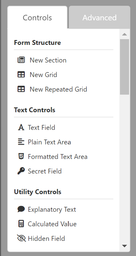
- A "Controls" tab for common structure and data controls
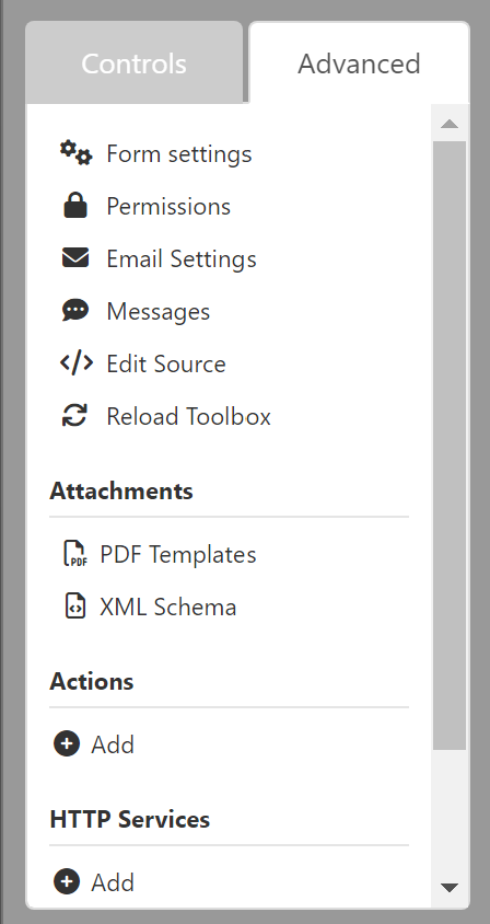
- An "Advanced" tab for form-wide settings and functions
For additional information on the Toolbox and controls, see:
The basic "Controls" tab of the Toolbox

The "Advanced" control tab of the Toolbox

See available controls in action
We have a few test forms we use to review form controls that you are invited to check out and try.
- All GOV Controls (and Wizard) demonstrates the custom controls we've set up for use in government as well as what a wizard (paged) form looks like
- All Orbeon Controls displays all the controls available, and some variants, but not the new video attachment ones
- Video controls test (experimental) demonstrates the new and experimental video controls offered
Editing controls

The editing controls appear above the tabbed portion of the Toolbox and can be used to:
- Open the form's settings
- Cut the selected control
- Copy the selected control
- Paste a control from the clipboard
- Undo your previous action(s)
- Redo your previous action(s)
You can use keyboard shortcuts for most of these.
Structure controls
The Form Structure section of the Controls tab is used to provide structure to both the layout of your form and its data. You can think in terms of "structured data".
New forms are automatically created with:
- One section
- One grid
- One plain text field
This is the minimum structure needed for a form.
New Section
Sections are containers for grids and data controls. Sections should be added whenever you're changing the content or context of a form. For example, one section for providing instructions, then another for collecting contact information.
- Each section becomes a 'page' when using the Wizard view
- They have both a regular label and a short label (used in the Wizard)
- You can change whether or not they're collapsible or initially open
- New sections automatically include a new grid with default settings
- Visibility and Read-Only settings apply to everything contained within them
For additional information, see:
- Orbeon Forms | Section and grid settings
- Orbeon Forms | Section settings
- Orbeon Forms | Repeat settings
New Grid
Grids are the containers that are used to lay out data controls. One is automatically included in each new section created.
- You can choose a 12- or 24-column layout for each grid
- Each row operates independently, allowing you to control the size of "cells" in that row
- Empty rows are collapsed at runtime, and you can 'merge' cells vertically to maintain horizontal alignment
- They are almost never referenced directly, so naming them is optional
- Visibility and Read-Only settings apply to everything contained within them
Grids are flexible, so you may only need one in a section. Consider adding a new grid when you have a set of fields you want to:
- Apply visibility to as a group
- Copy and paste as a group
- Use different layout settings for a group
- Change the grid tab order for mobile presentation
For additional information, see:
- Orbeon Forms | Section and grid settings
- Orbeon Forms | Grid settings
- Orbeon Forms | Repeat settings
New Repeated Grid
Repeated grids allow you to collect data with a table-like layout that can be repeated as needed for multilple entries. An example of this would be to collect the names and ages of children under a parent's or guardian's care.
- You can use a single row or multiple ones for each repetition
- You can specify a minimum and maximum number of rows for both display and entry
- Visibility and Read-Only settings apply to everything contained within them
For additional information, see:
- Orbeon Forms | Repeated grids
- Orbeon Forms | Repeat settings
- Orbeon Forms | Section and grid settings
Data controls (fields)
Most of the controls available on the Controls tab of the toolbox are for capturing or displaying content or data and could be called "fields".
They are grouped into the following categories:
- Text Controls for capturing text
- Utility Controls for descriptions and calculations
- Typed Controls for capturing other data like numbers, emails, phone numbers, etc.
- Data and Time controls for capturing a date, a time, or both
- Selection Controls for selecting one or more values, like dropwdown menus, radio buttons, etc.
- Attachments controls for attaching images or files
- Buttons for creating action buttons to use with Advanced controls (not for creating or selecting buttons that appear on your form)
Each control has a number of settings available. Many are common and shared, but the exact options will vary depending on the control itself.
For detailed information on Orbeon controls, see:
For an overview of control settings, see:
Government controls
We designed and added some government and Canadian-centric controls to Orbeon Forms. These are marked with the prefix "CA" and include:
- CA Phone Number which is masked to 1-###-###-####
- CA Postal Code which is masked to A1A 1A1
- CA Province which is a dropdown of the full province names
- CA Province Abbreviation which is a dropdown of province abbreviations
- CA Soc. Ins. Num. which is masked to ### ### ###
To learn more about these and see them in action, visit the test form:
Advanced controls
Advanced controls are used to:
- Configure your form, including setting a time-window or a wizard view
- Set up your emails
- Customize system messages
- Attach PDF templates
This is also the tab where you or your developers would set up two-way interactions with other systems.
For additional information, see:
Controls to avoid
Not every control available in Orbeon Forms is recommended. Some are simply pre-configured versions of another control provided for convenience or to support backwards compatibility with older versions of the software. Others are inherently inaccessible because they cannot be effectively used by someone who is unsighted or has motor difficulties.
The following are controls to consider avoiding (and why):
- Dropdown Date and Fields Date (redundant; you can set a Date to display in either of these formats)
- Dynamic Dropdown (for now; requires setting up external resources not yet documented)
- Video Attachment and Static Video (for now; this is a new 'experimental' control needing some refinement)
- Handwritten Signature (inaccessible; only suitable for sighted users using a stylus and touchscreen)
- Image Annotation (inaccessible; only suitable for sighted users)
Avoiding these will help future-proof your forms in the event these controls are removed or significantly altered.
