Managing control appearance and behaviours using settings
You can adjust how an individual control or set of controls appears or behaves using control settings.
On this page:
Overview
Control settings allow you to choose options for a control's appearance or behaviours. Settings are available on all controls, including structure (layout) and advanced ones, though the particular options available and arrangement will vary according to the control type.
To access a control's settings:
- Hover your cursor over the control
- Click the Settings icon (gears)
- It's to the left of structure controls
- It's on the right of other controls
The Control Settings dialogue window will open.
For detailed information about control settings, see:
Special settings
There are 4 settings that appear in multiple places that make sense to address separately.
Custom CSS classes
Custom CSS Classes appear in the Basic Settings of most controls.
They allow you to apply specific CSS code (classes) to a control. The class(es) applied must already exist in the CSS. You can't apply styling to your control here.
Currently, there are only 2 custom CSS classes available, both of which are designed to arrange lists of values horizontally instead of vertically.
To make checkboxes appear horizontally, use the class code:
xforms-select-appearance-xxforms-horizontal
To make radio buttons appear horizontally, use the class code:
xforms-select1-appearance-xxforms-horizontal
Additional custom CSS classes are expected to be developed in the future.
The default vertical display is recommended
Horizontal display of options can be more difficult for users to read and interact with, and the layout of the individuals options is determined by the length of the options. You should only consider this if you are laying out a form in a traditional paper-based design for autogeneration of a PDF.
Autocomplete attribute
An Autocomplete attribute dropdown appears in the Basic Settings tab of some control types.
This function allows you to "ask" the user's browser to suggest values for the fields, such as name, address or phone number.
For addtional information, see:
Use HTML
The "Use HTML" checkbox appears in many locations where text editing occurs.
Clicking the checkbox displays a rich text editor, but keep in mind that:
- Labels are bolded by style, so bolded text will not stand out on these
- An underline icon is missing because it's recommended that only links be underlined; but you can use Control-U if you 'must'
- Links off of forms should be opened in a new window so that entered data is not lost
Don't paste directly from Office applications
Many Office applications such as Word manage the appearance of text through custom CSS tags. When you copy content from Word, you're also copying all the custom CSS behind it such as font face, line height and spacing, colouring, etc. These tags will override government's settings and standards and produce undesirable results.
Unfortunately, there isn't a "Paste plain text option" in the editor (yet).
If you have content in Word or other formatted documents you want to reuse, consider pasting it into a plain text editor like Notepad first to remove all the styling tags. Then copy and paste the "cleaned" content. Reformatting and relinking the text is much faster and easier that finding and removing all the excess tags in the code later.
Template Parameters
A section labelled Template Parameters appears at the bottom of following tabs:
- Label
- Hint
- Help Message
- Explanatory Text
Email Settings also have a related Templates tab.
These template options allow you to easily combine text and form data to provide a more custom form-filling experience.
For additional information, see:
Settings tabs
Most of the controls available in the basic Controls tab of the Toolbox will offer the same assortment of tabs, with mostly the same appearance and options.
Basic Settings
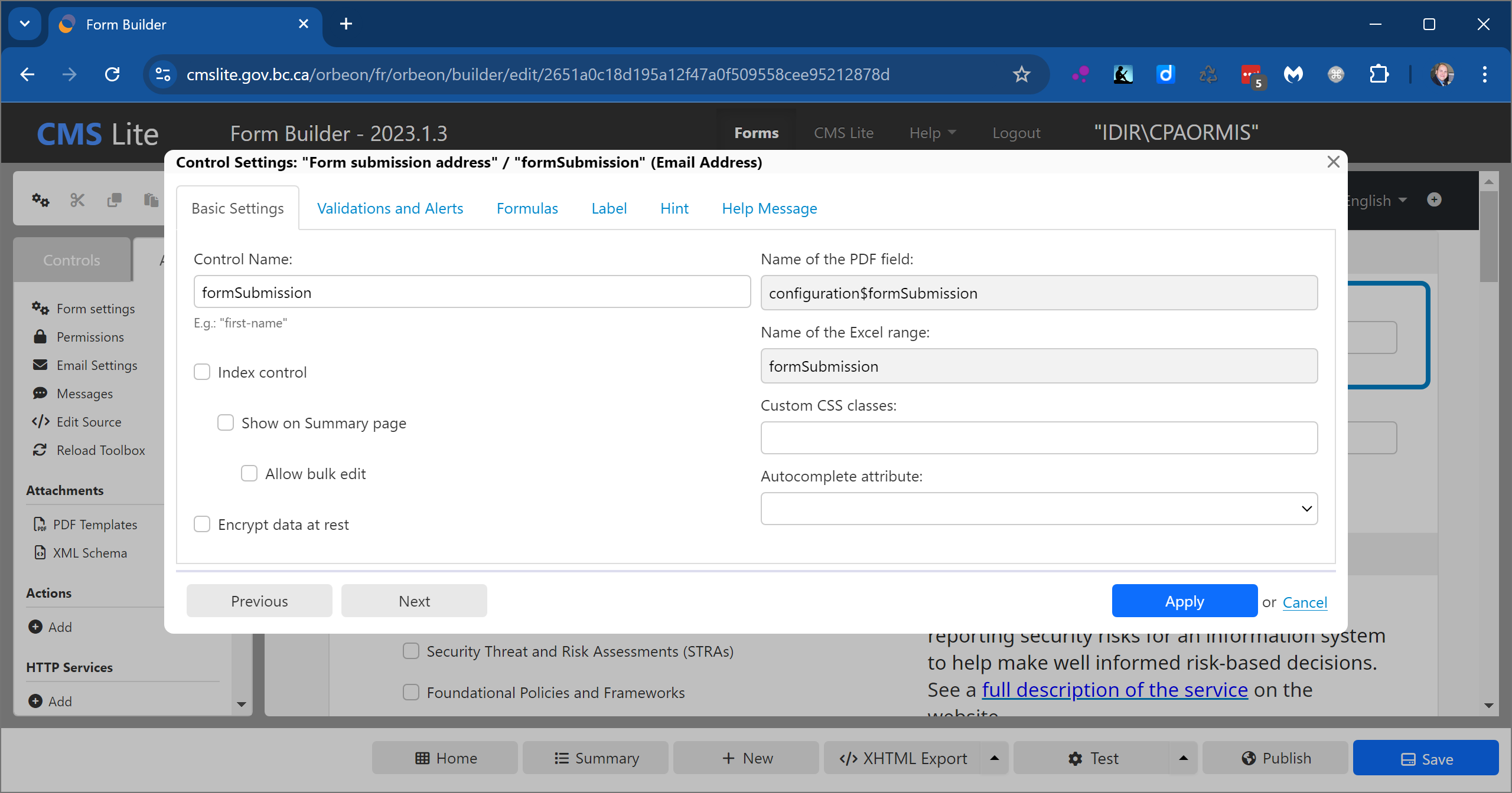
The Basic Settings tab is the one most subject to change from one control type to another.
Use the Basic Settings tab to:
- Name your control
- Identify the field name for a PDF template
- Choose appearance options, when available
- Choose how it's displayed on an autogenerated PDF
Validation and Alerts
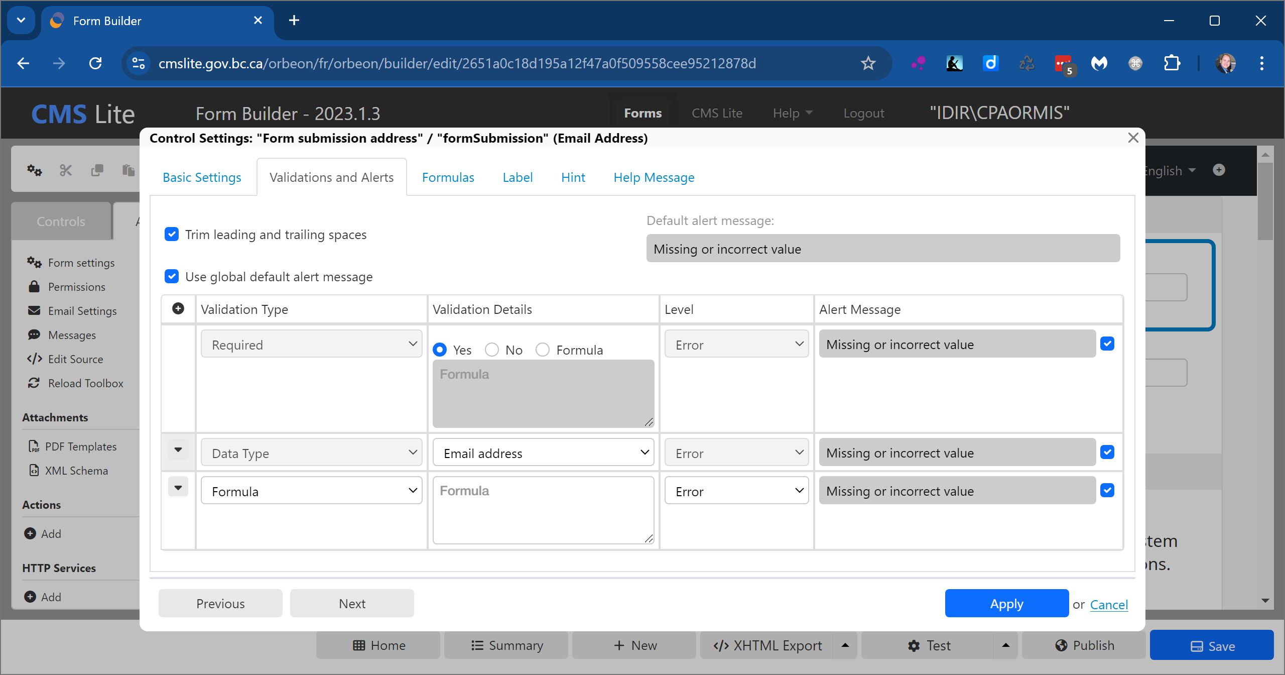
Use the Validations and Alerts tab to require or validate data.
Formulas
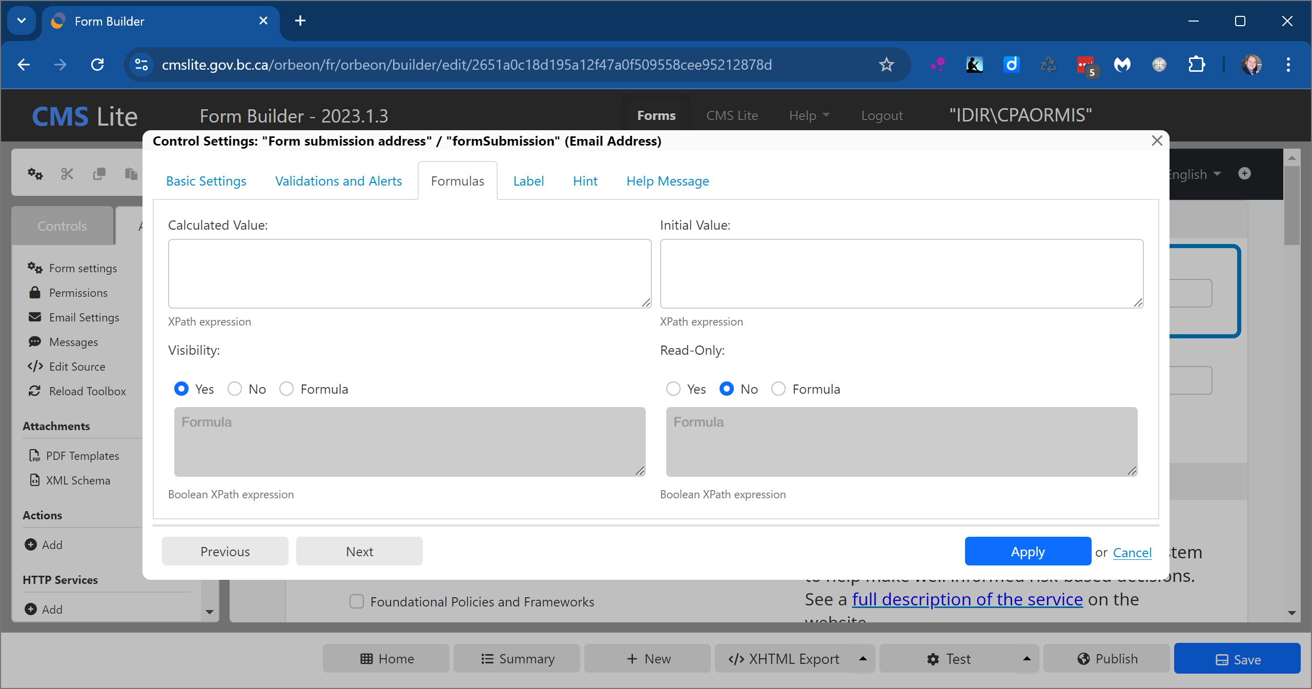
Use the Formulas tab to:
- Perform data calculations and text combinations
- Provide an initial value for users or testers
- Set visibility for interactions or testing
- Set the field as read-only for users or testers
For additional information, see:
Label
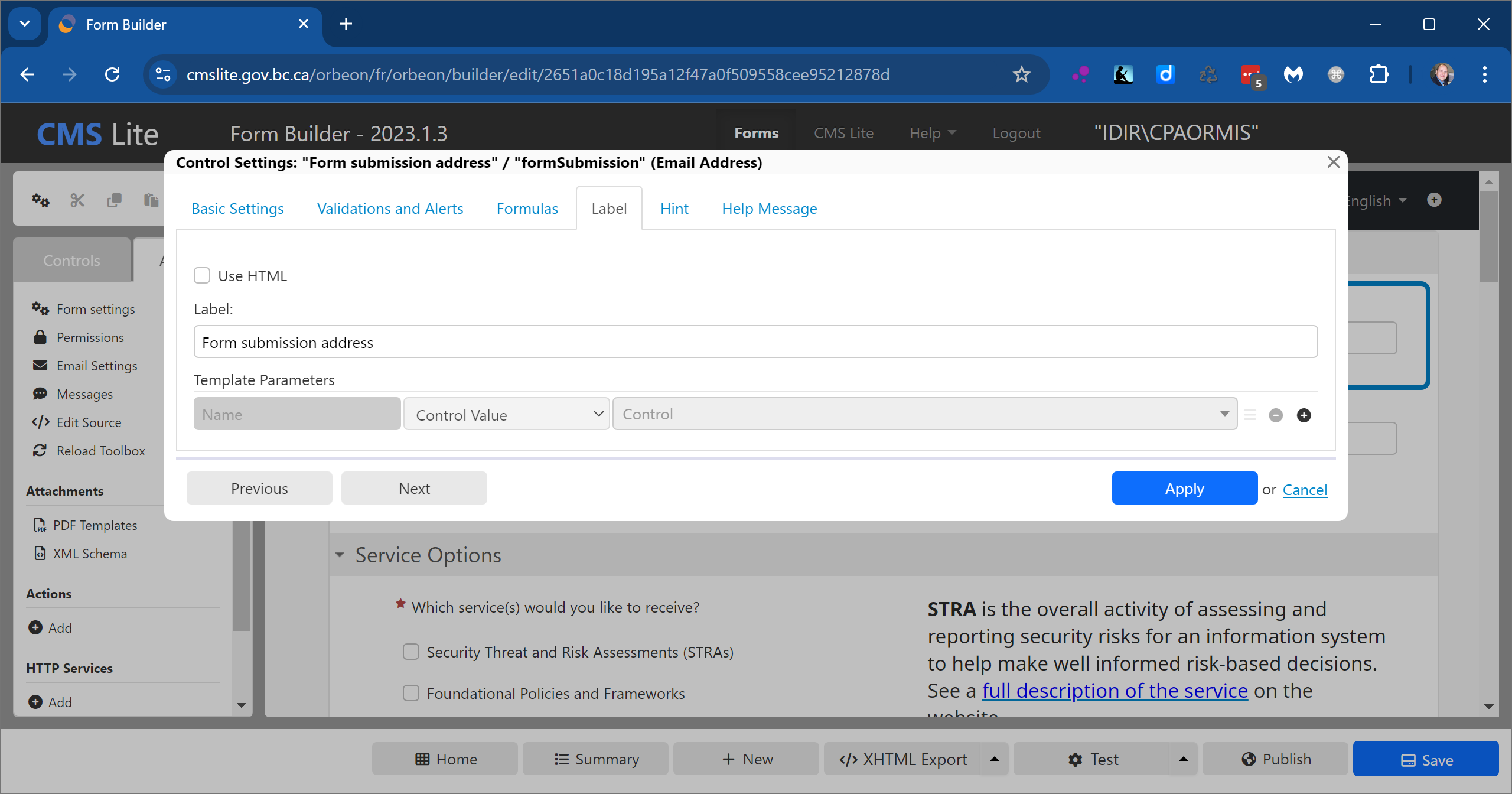
A label can be added to a control directly in the form builder.
Use the Label tab to:
- Access the rich text editor
- Incorporate form data into the label
Hint
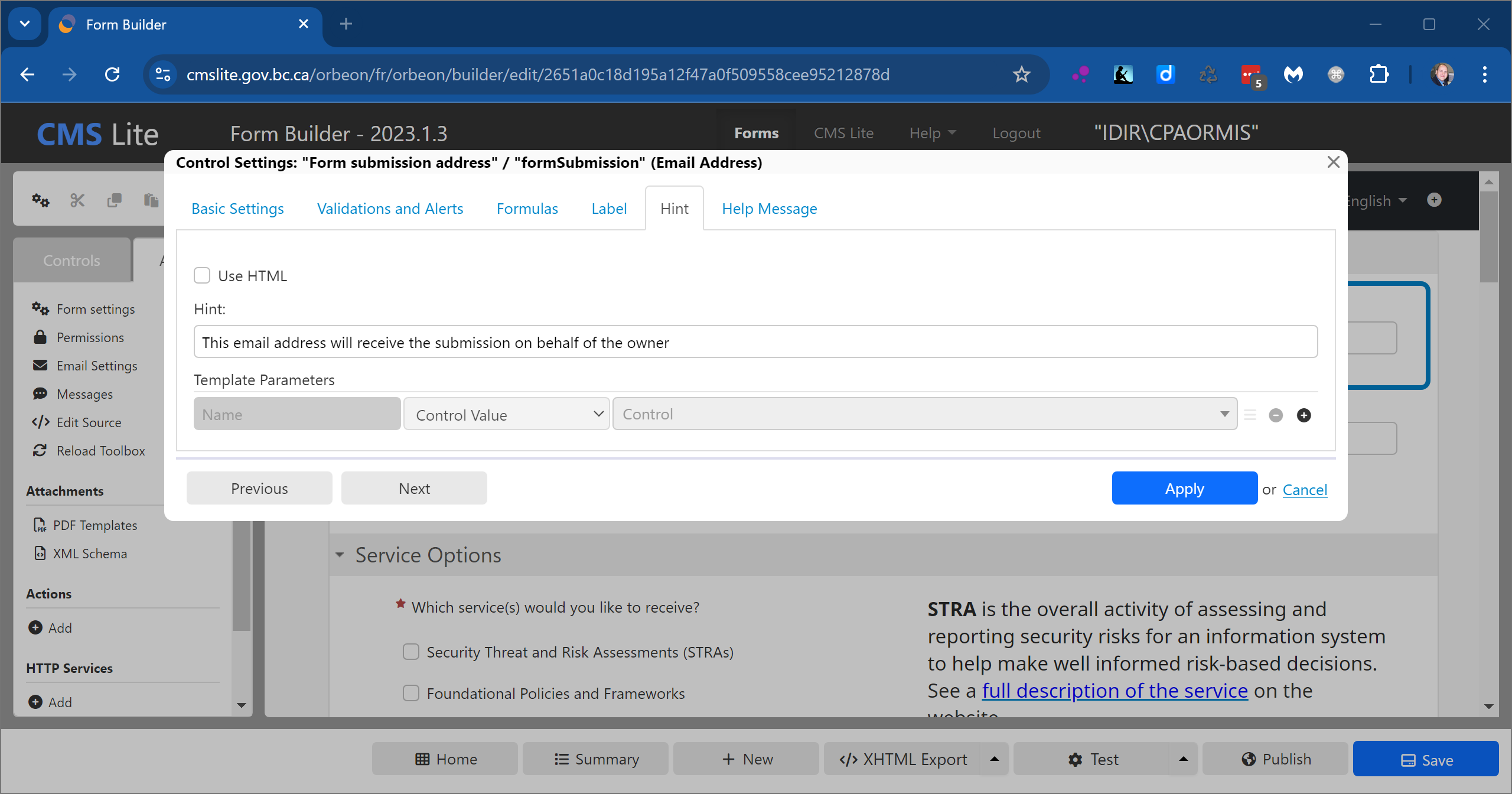
A hint can be added to a control directly in the form builder.
Use the Hint tab to:
- Access the rich text editor
- Incorporate form data into the hint
Help Message
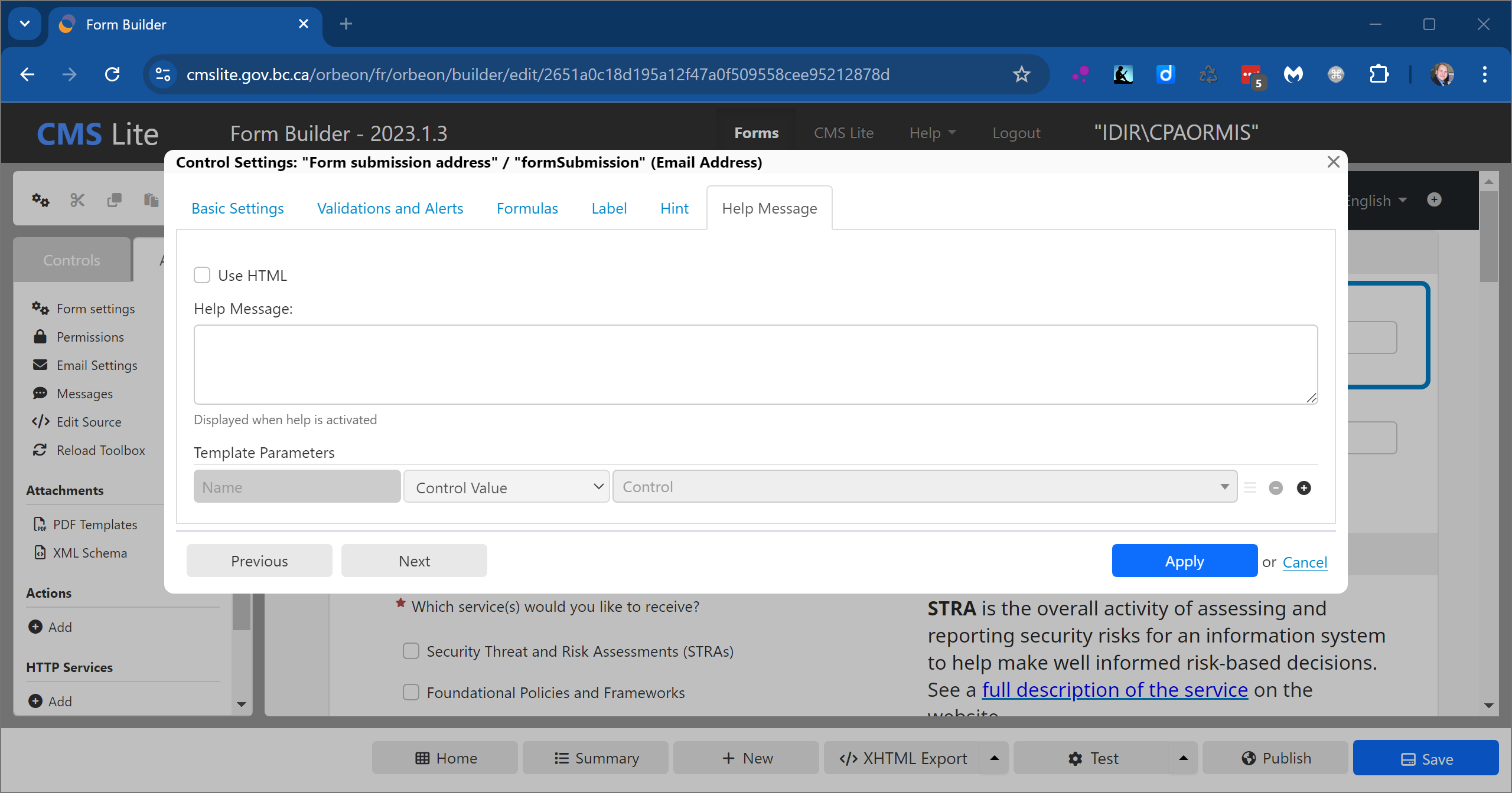
Help messages appear in a pop-up window connected to an information icon and can only be edited in the settings.
Use the Help Message tab to:
- Access the rich text editor
- Incorporate form data into the help message
Explanatory Text
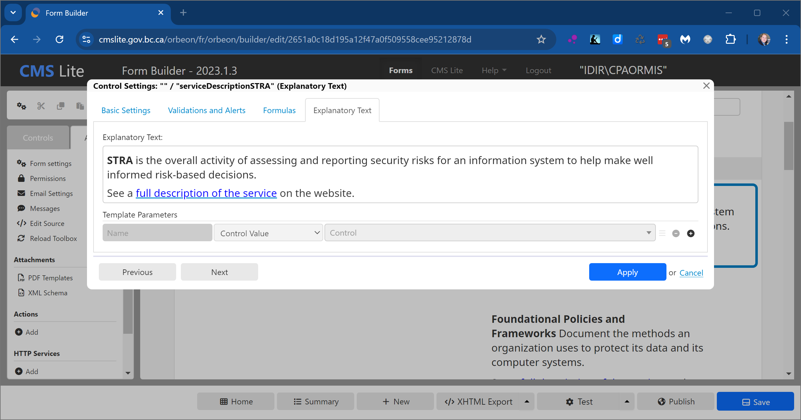
The Explanatory Text control is used to present information to a user, such as instructions. There are no label, hint, or help options for this control.
Use the Explanatory Text tab to:
- Have an easier editing experience with more visual space
- Incorporate form data into the explanation
