Government website headers
The login experience across B.C. government websites should be the same. A consistent approach provides a familiar interaction and a clear sense of connection. For example, Facebook, Google and PayPal all use similar features to log in – this makes it easy for individuals to know what to expect.
Before login
Before someone is logged into your website, the header will contain two actions:
- Sign up is the action for individuals new to your website
- Log in is the action for individuals returning to your website
Login
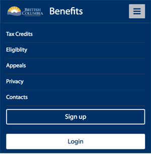
The login action should always be a button. The button should be placed in the top right corner of your website. When the screen size is smaller and the menu collapses, the login button should be placed at the bottom of the mobile menu. "Login" is the most common label for the button, although if you only accept one type of credential you may choose to specify the credential type in the label. See the language consistency section for more information.
Sign up
The action to sign up can be displayed as either a button or an action link, depending on your website's style guide. Sign up is considered a secondary action and login is the primary action – this means that the ‘login’ and ‘sign up’ actions should not look visually the same. The label of the action will depend on what login process you use and whether you require individuals to create an account for your website after they log in. For example, you may use one of these calls to action:
- Sign up
- New user?
- Enroll
- Sign up/Login * These two actions can only be combined if clicking on the button will always bring an individual to a login launch page that includes both login and sign up information. If the information to login and sign up is on different pages, you should use separate buttons or action links.
Examples
Example: Log in and sign up button placement in header
On a large screen:

On a mobile device:

Example: Log in and sign up combined button placement in header
On a large screen:

On a mobile device:

After login
After an individual is logged into your website, the header will change to contain different actions than before they log in.
- Log out to end their session
- Name of individual logged in provides visual confirmation that they're logged in
Name of individual logged in
Once an individual is logged in, display their name in the top right corner of your website. Always use the "display name" attribute you get from the B.C. government login website.
Don't:
- Take the display name apart
- Modify the format
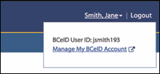
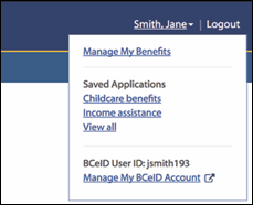
When an individual hovers over their name, a menu should appear. The menu should include:
- Their BCeID user ID – if logged in with a BCeID account
- Their business name – if logged in with a Business BCeID account
- A link to manage their account if logged in with a BCeID account or with their BC Services Card.
- Manage My BC Services Card Account - link to https://id.gov.bc.ca/account
- Manage My BCeID Account - link to https://www.bceid.ca/profile_management
- You can extend this menu to include a couple of important website-specific links, such as settings
Logout
Once logged in, display the option to log out. Logout is considered a secondary action. It can be displayed as either a button or a link. It should be placed in the top right corner of your website, beside the display name of the individual logged in. When the screen size is smaller and the menu collapses, the logout button should be placed at the bottom of the menu.
Examples
Example: Log out and display name in header

Example: Menu when logged in with a Basic BCeID

Example: Menu when logged in with a Business BCeID

Example: Menu when logged in with the BC Services Card app

Example: Menu extended to include a couple website-specific links

