
Design Guidelines for the B.C. Visual Identity Program
The topics on this page provide practical details within the design guidelines of the visual identity program.
Additional resources:
The visual identity program makes government authorship and actions recognizable to the public. So, it's critical that the identity be clear and consistent.
The BC Mark

The BC Mark (or logo) is central to the visual identity program. It is comprised of three elements:
- The symbol
- The British Columbia wordmark
- The keyline
Symbol element
-
The symbol is the sun rising behind a mountain range with the Pacific Ocean in the foreground.
-
The sun should always be the lightest part of the mark. This symbol provides continuity with the province’s heraldic crest. The mountain graphic represents strength and reliability.
-
Blue establishes a feeling of authority and trust. The warm rays of the sun balance the symbol and represent British Columbia’s bright future.
Wordmark element
-
The British Columbia wordmark is typeset with a customized version of Garamond. It conveys heritage and dependability.
-
The rounded serifs and soft forms of the typeface make it friendly and approachable.
Keyline element
-
The keyline underlines the wordmark to show "British Columbia" is important. Do not remove the keyline from the BC Mark.
BC Mark integrity
-
Keep all three elements of the BC Mark together. Dividing them or changing their size or position will reduce the mark’s quality and integrity.
-
It isn't acceptable to alter the BC Mark in any way. Always use the digital artwork exactly as provided. If you need to resize the mark, scale the mark proportionally. This preserves its aspect ratio and stops it from becoming distorted (looking squished, stretched).
-
It is recommended that high enough contrast be provided between the BC logo and background colour so it can be read by people with low vision or colour blindness. This ensures the quality of the logo does not deteriorate in any way and complies with accessibility standards. Check the colour contrast ratio using a tool such as the Web Aim Contrast Checker. If the contrast ratio falls below the specified requirements, adjust the colours of the background.
From a branding perspective
-
The BC Mark was created to consolidate the provincial government communication products under a single graphic entity to ensure the most effective and cost-efficient communication. A mark with the goal to help citizens and audiences easily identify provincial communication products. The BC ID program is one of the ways the province is ensuring ministries and provincial agencies communicate in a manner that achieves the highest standards from a branding perspective.
Using the BC Mark
All uses of the visual identity (the BC Mark) should maintain its integrity and legibility. The visual identity program makes government authorship and actions recognizable to the public. So, it's critical that the identity be clear and consistent.
BC Mark orientations
 Vertical orientation
The vertical orientation of the BC Mark is the primary and preferred configuration. Use this orientation whenever possible. It is the primary mark of government authorship.
Horizontal orientation
Use the horizontal orientation only when the area available is too small for the vertical orientation. This arrangement of the elements minimizes height.
Protective area
Protective area surrounds the BC Mark. This ensures the mark is uncrowded and highly visible.
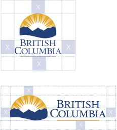
Vertical protective area
The protective area is equal to the distance between the top of “British” and the baseline of “Columbia”.
Horizontal protective area
The protective area is equal to the distance between the baseline of "British" and the baseline of "Columbia".
Background and contrast
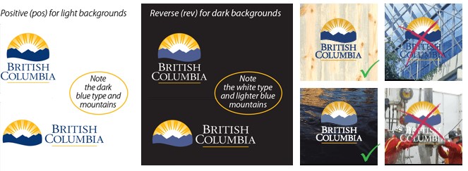
The sun in the symbol should always be the lightest part of the mark. The BC Mark should appear in its two-colour version whenever possible. When the background is light, use the positive, two-colour version of the BC Mark.
When the background field is dark, designers must use the reverse version. Ensure significant contrast between the corporate blue and the background. Never use a “busy” photo or high-contrast pattern behind the BC Mark.
Minimum size
It is important that the BC Mark be reproduced at a size large enough to be legible so that the province's programs, services and contributions can be recognized by the public.
 Vertical orientation: In print, the BC Mark should be greater than 0.46" (11.7 mm) in height. On the Web, the mark's total height should be greater than 50 pixels.
 Horizontal orientation: In print, the BC Mark's symbol should be greater than 0.23" (5.8 mm) in height. On the Web, the mark's total height should be greater than 25 pixels.
Prevent misuse
Protect the integrity of the BC Mark by following these reproduction guidelines:
- The sun is the brightest area of the symbol. Don't reproduce the mark so the sun is the darkest area.
- The mark should not appear within frames or borders.
- Don't tilt or skew the mark.
- Don't substitute, scale or alter the "British Columbia" typeface.
- Never use the BC Mark or its component elements as a part of other visual identities or graphics.
- Similarly, don't incorporate other visual elements into the mark.
- Don’t use the mark's type or symbol alone in communications.
- Never stretch or condense the BC Mark to make it "fit." The horizontal and vertical dimensions should always change equally and proportionately.
- The BC ID mark should not be used in QR codes as it goes against the requirement that the BC mark must be a minimum size.

Colour space
There are two different ways to reproduce digital artwork: in print or on-screen. Print and screens use different technologies to produce colour. Here is a description of these two different technologies.
CMYK colour space
Print reproduction relies on ink applied to paper. Four ink colours - Cyan, Magenta, Yellow and Black (called CMYK) - are printed in small dots. These dots visually “mix” on paper to create the illusion of all the colours of the rainbow.

Digital artwork reproduced in print needs to be in CMYK or black colour space. Black colour space includes all shades of grey.
RGB colour space
On-screen reproduction relies on light. There are three primary colours of light - Red, Green and Blue (called RGB). These three colours of light visually “mix” on-screen to create every colour of the rainbow.
Digital artwork reproduced on-screen needs to be in RGB colour space.

Digital file formats
There are two basic digital artwork formats: vector and raster. To identify them, you need to see a file's extension. If file extensions are hidden on your Windows computer, show them by checking the "File name extensions" box under the "View" tab in Explorer.
Vector artwork files
Vector digital artwork uses geometric shapes to create images. Vector artwork is very versatile because it can be enlarged or reduced to any size and still be sharp and crisp. Vectors are great for logos like the BC Mark.
Files with EPS, AI, WMF and SVG extensions are almost always vector artwork. PDF files can contain both vector and raster artwork.

Raster artwork files
Raster digital artwork is a grid of tiny square, coloured picture elements (pixels). Packing pixels together in a raster file creates the illusion of an image. Rasters are great for photos. But increasing raster artwork too much in size makes the pixels very obvious.
Files with JPG, TIF, PNG and GIF extensions are always raster artwork. PDF files can contain both vector and raster artwork.

Colour palette and typography
The province's visual identity uses two colours (yellow and blue) and employs three typefaces (Adobe Garamond, Adobe Myriad and BC Sans).
Colour palette and guidelines
- Always ensure proper contrast between the background and the colours in the BC Mark.
- Avoid conflicting colour tonal values and hues.
- Use the blue at 100 per cent of its value in the symbol if the value of the background is between 50 and 60 per cent of black.
- Reduce the value of the blue to 60 per cent when the tonal value of the background exceeds 80 per cent of black.
- Use the positive version of the BC Mark if the value of the background is less than 15 per cent of black.
- The BC Mark should appear in its two-colour version whenever possible.
- If printing specifications or budget restrictions don’t permit the use of PMS colours, use the CMYK versions.
- For on-screen use, choose the RGB versions.
- Reproduce the BC Mark in one dark value of a deep hue (or in white or a light value of a light hue) only if a design calls for this.
Below are breakdowns for the two colours.
| Colour | Pantone (PMS) | CMYK | RGB | Hex |
|---|---|---|---|---|
|
130c Coated |
C 0 |
R 227 |
#e3a82b |
|
|
|
288c Coated |
C 100 |
R 35 |
#234075 |
Typography
These three typefaces are recognizable elements of the province’s visual identity. They should be used in all visual communications. Align text on the left with a ragged right edge whenever possible.
Adobe Garamond
Adobe Garamond Pro is a serif typeface in three weights plus italics and is suitable for headlines and body text. Don't use other versions of Garamond as they will have unexpected features.

Adobe Myriad
Adobe Myriad Pro is a sans-serif typeface in five styles, five weights plus italics. It is suitable for headlines and body text, and is the primary typeface for use in documents, advertising and online.

Buy Adobe Garamond Pro and Adobe Myriad Pro online from Adobe. These typefaces are available from other reputable font vendors as well.
BC Sans
BC Sans (2.0) is an open-source typeface and free to download. This typeface was developed for government to improve the readability and delivery of digital services. It was designed to support special characters and syllabics found in Indigenous Languages in B.C.

BC Sans is required for use on all new and current government webpages on gov.bc.ca, as well as government web services hosted outside of gov.bc.ca. Gov.bc.ca webpages have already been updated, those hosted outside are to be updated during maintenance.
The BC Sans typeface stems from the Noto Sans typeface. Noto Sans must not be used for websites. However, for all other platforms, Noto Sans is an acceptable alternative as it provides advanced typographic features.
It is available on B.C. Government workstations and under its open-font license, it can be freely shared, downloaded, and installed on any computer.
Signage
The King's Printer produces government signs using pre-qualified sign fabricators across the province. Ministries shouldn't directly contract sign fabricators to produce government signs but instead work with Kings Printer.
All signs must meet government visual identity guidelines. For help with making and ordering a sign, depending on what you need, contact the Provincial Sign Program or GCPE Graphic Communications (through your ministry’s GCPE communications office).

Door and office entrance signs
Contact the King's Printer or GCPE's Graphic Communications team for office sign solutions.
Interior wayfinding signs
Contact the King's Printer for interior wayfinding sign solutions.
Exterior signs
StrongerBC capital investment signs
Commemorative plaques and markers
Information signs
Warning, Caution & Danger signs
Standard sign blank dimensions
The Ministry of Transportation and Infrastructure's Provincial Sign Program maintains a catalogue of dimensions for standard aluminum signs.
Promotional items

The government's Comptroller General sees all promotional items as informational communications. Ministries should budget these items under STOB 67.
GCPE’s Advertising and Marketing Services include promotions. A promotion is anything that advertises the Government of British Columbia. It can be a publication, brochure, poster, video, pen, lapel pin, button, coffee mug, sign, and more.
Ministries that need promotional items must first contact their ministry’s GCPE communications office.
The Protocol and Recognition Products branch has many qualified and competitive suppliers available. They are available to produce any promotional items.
Stationery
The BC Mark is the only mark approved for use on the front of government public service stationery. There is no flexibility in the design, content or print specifications for stationery. This policy ensures recipients immediately recognize the authority of government employees.
Only government employees can use government-issued business cards and stationery.
Purpose of government stationery
The government is the source of provincial policies, laws, programs and services. Stationery shows recipients that the sender is an agent of the Government of British Columbia. Accurate reproduction of the appropriate marks signifies government authorship and responsibility.
Printing stationery
Order pre-printed letterhead and business cards from King's Printer only. Use professionally printed stationery for all official correspondence. Before ordering stationery, verify the correct mailing address with BC Mail Plus. King’s Printer has current electronic design templates for all stationery.
Desktop printers can’t print the BC Mark accurately or professionally, so avoid using these printers for stationery items.
Stationery suites
Government stationery includes two suites.
- The Public Service stationery suite which uses the BC Mark.
- The Executive stationery suite* which uses the B.C. Coat of Arms.
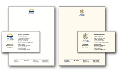
*Only members of the Executive, Legislative and Judicial branches of government and their immediate staff can use Executive stationery.
Fleet vehicles
All government vehicles should include the BC Mark on both sides and the rear of the vehicle.
This clearly shows the vehicle is in service to the public. It also reinforces the visual identity in a mobile and visible way. Refer to the Procurement Services Branch's Vehicle Fleet Management and the general BC vehicle identity guidelines (PDF, 2.6 MB) to plan a fleet vehicle visual identity program.

Accessibility
Whenever possible, official marks should always include the most current accessibility best practices as outlined in the B.C. Government Accessibility and Inclusion Toolkit.
- Displaying Your Brand Name: For optimal accessibility, all new marks should contain spaces between words, where possible. Additionally, use spaces between words when presenting your brand name in public communications, unless otherwise specified in the logo's graphic standards. This practice helps screen readers accurately interpret and vocalize the name. For example: “BC Parks,” “Data BC,” “Service BC,” etc. If you have any doubts, please consult the department responsible for the brand.
-
Acronyms: The Government of British Columbia utilizes numerous acronyms that may not be familiar to the general public. For official marks, the use of acronyms is not recommended; instead, the full name should be written out. If an acronym is used, it should appear alongside the full name. While entities may use acronyms in their internal communications, they should refrain from using them in their official marks.
-
Colour Contrast: Always use the most suitable colour variation of your logo to ensure optimal contrast. Placing your logo on a similarly coloured background can make it difficult for viewers to see. This ensures the quality of the logo does not deteriorate in any way and complies with accessibility standards. Check the colour contrast ratio using a tool such as the Web Aim Contrast Checker. If the contrast ratio falls below the specified requirements, adjust the colours of the background. Important content and logos have a required standard of WCAG AA. The BCID Colour Accessibility Reference Guide (PDF, 328 KB) has been created showing what is permissible with these colour contrast accessibility standards.
-
"Alt" text for Logos: When official marks are displayed online, they must include appropriate alternative text (alt text) to describe the mark for users who rely on screen readers. It should be short and describe what the image is. Example: For the BC Mark, the alt text could be: "British Columbia logo".
-
Using Logos in Animation: If marks are ever used in animated form (e.g., in digital interfaces), guidelines should prevent excessive flashing or rapid motion that could trigger seizures or be distracting.
Form standards
When using provincial logos on forms, please consider the following best practices:
- Use the solid black version of logos whenever possible. This ensures the logo maintains its quality across various processes such as faxing, scanning, printing, and duplication.
- All forms must include the official authoring logo that represents the responsible program area. This logo must be approved and align with the Provincial Brand Architecture.
- It is recommended (but not required) to use the general BC logo on forms instead of the Ministry Mark, as ministry names are subject to frequent changes.
All forms are encouraged to follow the standards and best practices outlined by the Inter-Ministry Forms Committee (IMFC). Please refer to forms management and design for more information.
App standards
- Include your GCPE Communications Office: Any materials prepared for public consumption must be approved by your ministry-dedicated GCPE Communication Office – per core policy. Additionally, please notify your GCPE Communications Director prior to planning launch timelines.
- Official name: All official app names must follow the process for creating a new official name or revising an existing official name. (IDIR required.)
- App avatars and favicons: App avatars and favicons must use the restricted tiny alternate BC Mark (or approved authoring logo, if different from the BC Identity). Because this is a restricted mark, the avatar is available upon request (from GCPE Graphic Communications). This alternate mark is ONLY permitted for avatars. Programs must defer to the regular BCID Mark (or their official authoring logo, approved under the provincial brand architecture) for all other uses within the app.
- Developer/publisher name: Apps published to the Apple App Store or Google Play should use the approved “Government of British Columbia” publisher/developer name. Ministry names are prone to changing so it is best to use our official provincial name.
- App description: App descriptions should follow the BC Government editorial style guide and clearly identify the app as an official Government of British Columbia product.
- Screenshots, graphics or communication materials: Any screenshots, promotional graphics or communication materials used in app stores (or in the app itself) must comply with the BC visual identity (BCID) brand standards (or align with provincial brand architecture standards, if different from the BCID).
- Accessibility: Apps (including content and logos used within it) should meet BC Government accessibility requirements and guidelines. This includes the WCAG colour contrast “AA standard”. More details available in the above accessibility section.
- Privacy: Apps that collect personal information must comply with applicable BC Government privacy requirements and include a link to the appropriate privacy notice.
- Sourcing assets: When sourcing assets be sure to follow best practices. (IDIR required.)
- Support URL and contact information: Support URLs and contact information provided in app store listings should point to official gov.bc.ca web properties or generic government contact channels. Personal or ministry-specific email addresses are prone to changing, so it is best to use enduring provincial contact points.
Subscribe
Enter your email address to subscribe to updates of this page.
Contact information
For questions or concerns regarding content on this webpage, please email:
bcgovlogos@gov.bc.ca.