Making checkboxes and radio buttons appear horizontally
 Last updated on August 2, 2022
By default, checkboxes and radio buttons are displayed in vertical format. You can change the appearance to be horizontal instead using a Custom CSS Class.
The default vertical display is recommended. Horizontal display of options can be more difficult for users to read and interact with, and the layout of the individuals options is determined by the length of the options. You should only consider this if you are laying out a form in a traditional paper-based design for autogeneration of a PDF.
What these CSS Classes do:
- These custom classes display a checkbox or radio button control horizontally instead of vertically.
The Custom CSS Classes:
For checkbox controls:
xforms-select-appearance-xxforms-horizontal
For radio button controls:
xforms-select1-appearance-xxforms-horizontal
How to use these Custom CSS Classes:
- Copy the appropriate script above.
- Select the checkbox or radio button control you want to customize.
- Open the control's settings.
- Paste the class into the Custom CSS Classes field of the Basic Settings tab.
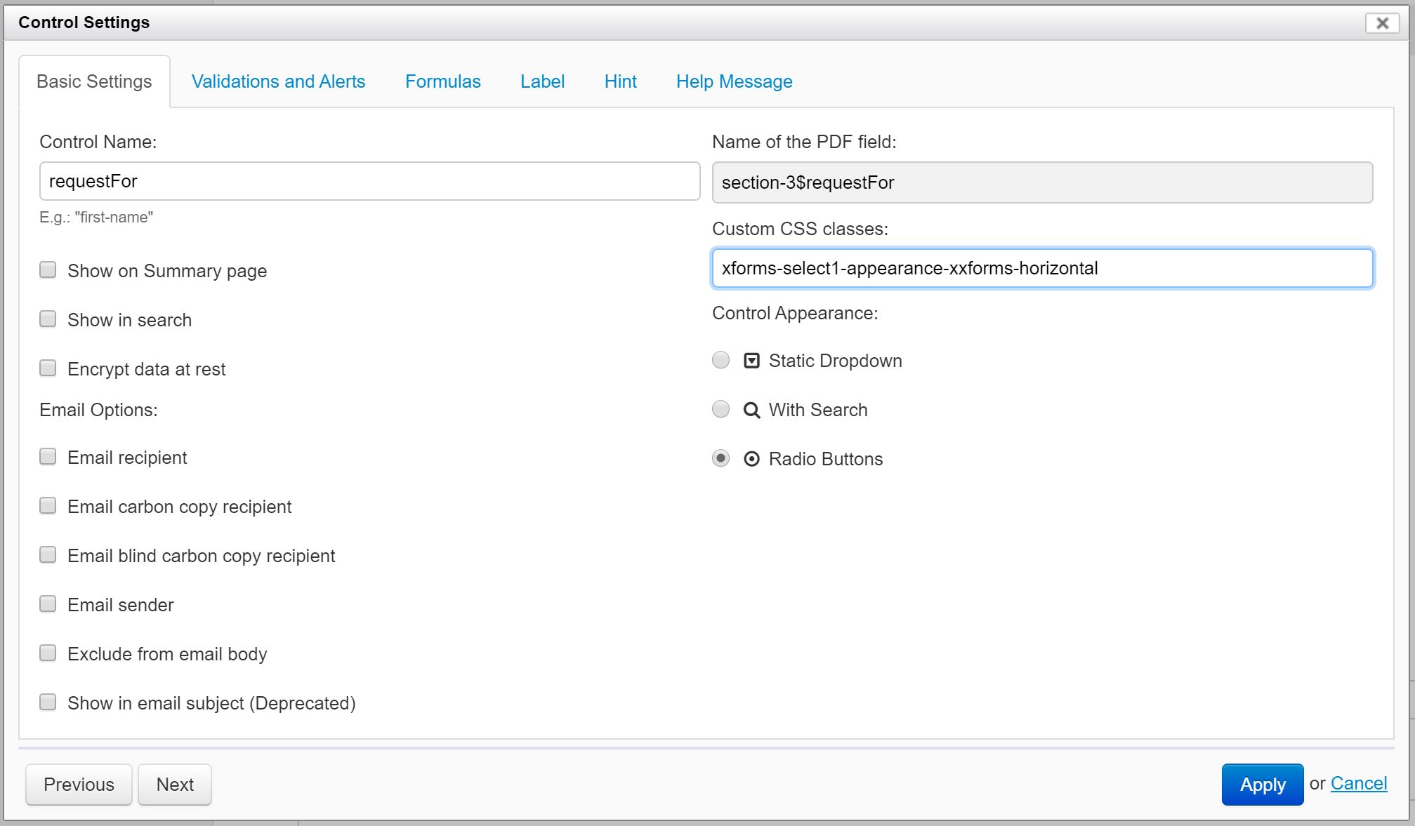
- Click the Apply button.
You may need to adjust the width of the control to better fit the content.
Results:
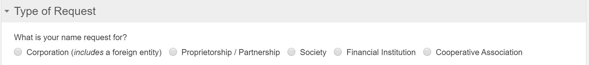
Before the addition of the custom class (default):
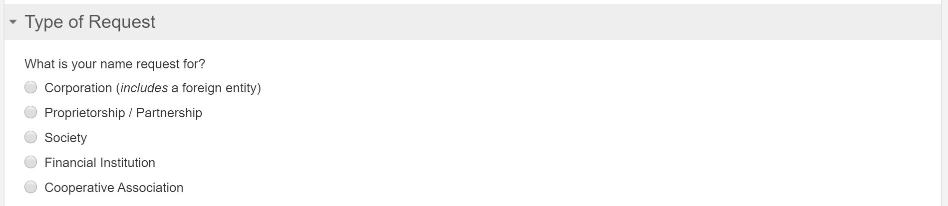
After the addition of the custom class: