Design tokens
Design tokens in the B.C. Design System provide the basic building blocks for visually consistent user interfaces.
On this page:
How design tokens work
Design tokens in the B.C. Design System provide a method to quickly and consistently implement the province's look and feel for digital services.
Design tokens are basic design decisions, encoded as structured data. The design tokens schema is a source of truth for:
- Colour
- Typography
- Elevation
- Sizing
- Spacing
The design tokens packages offer a flexible set of standardized options to help both designers and developers style digital interfaces consistently.
Token structure
A design token is a semantically-named and human-readable alias for a style value, like a colour. Each design token is a key-value pair. Token aliases replace hard-coded values in your prototypes and stylesheets, in order to:
- Reduce the risk of error or inconsistency between different products and interfaces
- Make it easier to change the visual design of an interface in the future
Understanding token naming
A token's name is a string that describes:
- What a token does
- How and where it is used
Most token strings have between 3 and 6 component parts, and look like this: System.Usage.Property.Modifier.Component.Variant
How to read a token name
Each part of a token name provides context for its associated value and proper usage:
- System (optional): a namespace value, to give context and reduce the risk of collision with other styles or classes
- Usage: provides a high-level category for the token — for example, whether it relates to layout or typography
- Property: describes the type of value that a token represents, like a colour or text property
- Modifier: defines specific context for the token — for example, differentiating between colour variants
- Component (optional): indicates that a token relates to a specific UI element, like a button
- Variant (optional): indicates that a token relates to a specific state or behaviour, like a hover effect
You can think about design tokens like a structured description of a physical object.
For example, let's take a token that describes the specific characteristics of a piece of furniture: House.LivingRoom.DiningTable.Marble.Leg.Oak
The token name tells us:
- The general location of the object: House (System)
- The specific location of the object: Living room (Usage)
- The type of object: Dining table (Property)
- A specific characteristic of the object: Marble dining table (Modifier)
- A component part of the object: Table leg (Component)
- A specific characteristic of that component part: Oak (Variant)
Installation and configuration
How you access and use design tokens is different for designers and developers.
Using design tokens in your project
The design tokens glossary contains a searchable list of all design tokens and their values.
Design tokens change how we define values in code and prototypes, by creating a single source of truth that we reference when styling user interfaces.
For example, if we want to style a button with the default dark blue background, we would normally use the hex value: #013366
Using design tokens, we instead use the token: surface.color.primary.button.default.
This approach helps ensure consistency, and makes future change easy to implement. If in the future we decide that buttons should now be green instead of blue, teams don't have to locate and update every instance of that hex code — it only needs to be updated in the tokens schema.
Design tokens and components
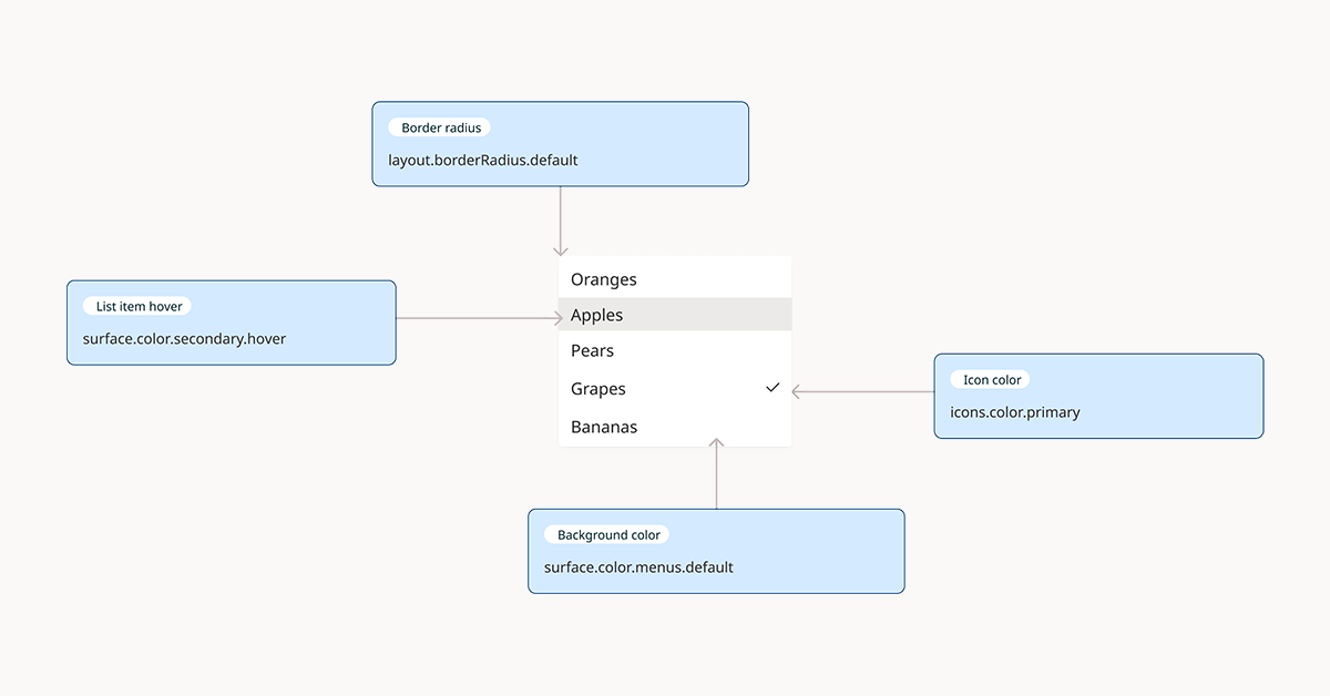
The design system component library is implemented using Figma and React. Design tokens are used to style each component, to ensure internal consistency and ease of maintenance.
For teams using other front-end frameworks or technologies, design tokens provide a relatively platform-agnostic way to reimplement components consistently.

