Design tokens for designers
Guidance for designers on how to install and use the B.C. Design Tokens library in Figma.
On this page:
Getting started with tokens
You need a Figma license to make full use of the design tokens library. Some functionality is not available on other account types. Access to the Government of B.C.'s enterprise license is administered by the CITZ Information Management Branch.
Design tokens are expressed as variables and styles in Figma. To get started with design tokens, you'll need the B.C. Design Tokens library file.
This file contains:
- Basic documentation and references for the design tokens implementation
- The complete tokens schema, formatted as variables and styles
Learn how to add a library to your project.
Recommended: install the managed library
If you are a member of the Government of B.C. organisation on Figma, you can add the B.C. Design System library to your projects directly.
Using this managed library makes it easy to receive updates when they are released.
Download and import the library manually
If you are not a member of the Government of B.C. organisation, you can download the library via Figma Community.
You can then self-publish it as a library for yourself or your team to use in your projects.
Using tokens in your projects
Style and variable names in the Figma library correlate to token names in the developer package, to help you communicate with your developer colleagues.
Once you've loaded the design tokens library into your project, you can access tokens as variables and styles.
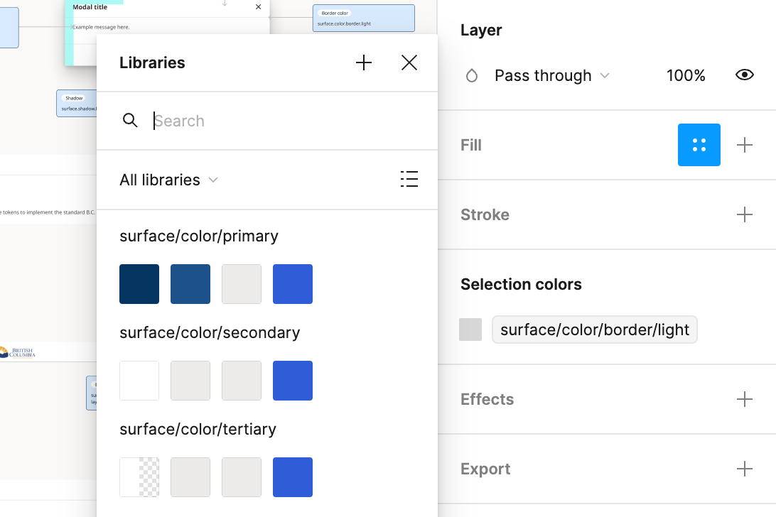
Click the 'styles and variables' icon (four dots in a square) in the layout panel to browse and select available tokens.
To find a specific token, use the search bar in the libraries menu. Try searching by element (eg. 'border'), state (eg. 'hover' or 'warning') or a specific style (eg. 'H1').

How tokens are organised
The design tokens library includes almost 200 individual tokens. Tokens are organised by type and intended usage, in a tree structure:
- Surface: colour palettes and effects used to style UI elements
- Support: colour palettes used for messaging (status, alerts and warnings)
- Layout: sizing and spacing measures, designed for use with Figma's auto layout features
- Typography: values used to implement the typescale
- Icons: sizing and colour values for icons and indicators
To explore the full list of tokens, consult the list in the B.C. Design Tokens library file or view the design tokens glossary.
