Alpha Gov
Government Digital Experience (GDX) will be introducing a new look and feel for www.gov.bc.ca.
What’s changing and why?
The redesign is a part of gov.bc.ca's continuing evolution to meet the needs of people in B.C. Since the site first launched in 1997, its look and feel (not to mention its content and functionality) have changed dramatically. The site has evolved to keep pace with the latest technological developments, new web standards, and changing user needs and expectations.
Today, more and more people access the website using a mobile device. Just four years ago, only 20% of visitors to gov.bc.ca were mobile users. In 2021, over 50% of visitors to the website used a mobile device, and we expect the upward trend to continue. Especially over the past several years, its become increasingly important for people to easily locate clear and up-to-date information on the government’s website.
Based on our research and the latest best practices, the new design is less cluttered, with information better organized for end users. In addition, it features a strong vertical layout, optimized for mobile.
What’s next?
Improving the website’s look and feel is just the first step in making government online information access better. We know there is a strong need for improved content (e.g., more plain language) and new functionality, plus a desire for better tools to support web services across government.
With the Alpha phase of the redesign complete, GDX is putting on the final touches before the new gov.bc.ca launch in early 2024.
Want to learn more?
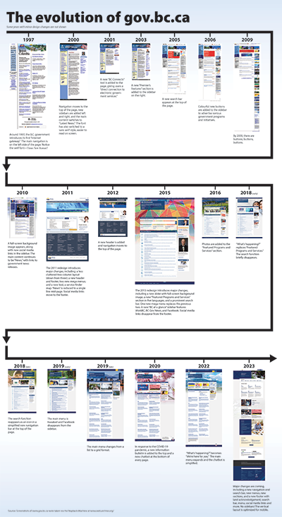
Check out the Evolution of Gov.bc.ca infographic to see how www.gov.bc.ca has evolved from 1990s “Internet Gateway” to the newest clutter-free, mobile-friendly site.
Evolution of Gov.bc.ca Infographic Text Description
The design of the B.C. government’s website, www.gov.bc.ca, has changed dramatically since it first launched around 1997.
In 1997, the main navigation was on the left side of the page. The font was a serif style, perhaps Times New Roman.
In 2000, navigation moved to the top of the page, new sidebars were added, and the main content became “Latest News.” The font also switched to a sans serif style, which is easier to read on screen.
In 2001, a new “BC Connects” tool was added to the page, giving users a “direct connection to electronic government services.”
In 2003, a new “Premier’s Features” section was added to the sidebar.
In 2005, a new search bar appeared at the top of the page.
In 2006, the sidebar was populated with colourful new buttons that advertised government programs and initiatives, such as DriveBC and Fair Pharmacare.
By 2009, the sidebar had grown much longer, with more than 20 buttons trailing down the right-hand side of the page.
In 2010, a full-screen background image appeared on the page, along with new social media links in the sidebar. The main content continued to be “News,” linking to government news releases.
In 2011, there was a major redesign. The website saw major changes, including a less cluttered look and feel, a new header and footer, two new mega menus, and a new tool (a service finder map). The “News” section was reduced to a single line mid-page. Social media links moved from the sidebar to the footer.
In 2012, a new header was added, and navigation moved to the top of the page.
In 2015, there was another redesign. Major changes included a new slider with full-screen background image, a new “Featured Programs and Services” section in five languages, and a prominent search bar. In addition, one new mega menu replaced the previous two. A new “BC at a glance” sidebar featured the WorkBC program, BC Gov News, and Facebook. Social media links disappeared from the footer.
In 2016, three small photos were added to the “Featured Programs and Services” section.
In early 2018, the title “What’s Happening?” replaced the title “Featured Programs and Services.” The search function briefly disappeared.
By late 2018, the search function had reappeared as a magnifying glass icon in a simplified new navigation bar at the top of the page.
In early 2019, the main menu was tweaked (headings were bolded) and Facebook disappeared from the sidebar.
By late 2019, the main menu changed from a list to a grid format.
In 2020, in response to the COVID-19 pandemic, a new information bulletin was added to the top of the page, and a new chatbot appeared at the bottom.
In 2022, the title “What’s happening?” became the title “We’re here for you.” The main menu expanded. The appearance of the chatbot was simplified.
And coming soon…
In 2023, the website will undergo another major redesign. Major changes will include a new navigation and search bar at the top of the page, new menus, new “In the News” and “Get Involved” sections, and a new footer featuring a land acknowledgement, search bar, menu, social media links and more. Sidebars disappear as the website takes on a strong vertical layout that is optimized for mobile use.
Read the Digital Principles for the Government of British Columbia.
About GDX
Among other things, Government Digital Experience is responsible for web development and setting the web content standards and guides for providing information and services to British Columbians online.
We develop and maintain many digital products that improve the online experience for people and offer support for digital services. Read more about Service Experience and Digital Delivery.

